

Go Green with Nest.
Go Green with Nest.
Redesigning the Nest Thermostat for environmentally-friendly and budget-conscious users.
Redesigning the Nest Thermostat for environmentally-friendly and budget-conscious users.
Redesigning the Nest Thermostat for environmentally-friendly and budget-conscious users.

Role
UX Design Lead
Thermostat Device Lead Designer
Skills and Tasks
UI Design
Interaction Design
Design Systems
Usability Testing
Duration
10 weeks
Tools
Figma
Team
Dylan Randall-Newburg
Lenora Fernandes
Divisha Kotawala
Xirun Zhou
Yixian Wang
An Environmentally-Friendly and Budget-Conscious Thermostat
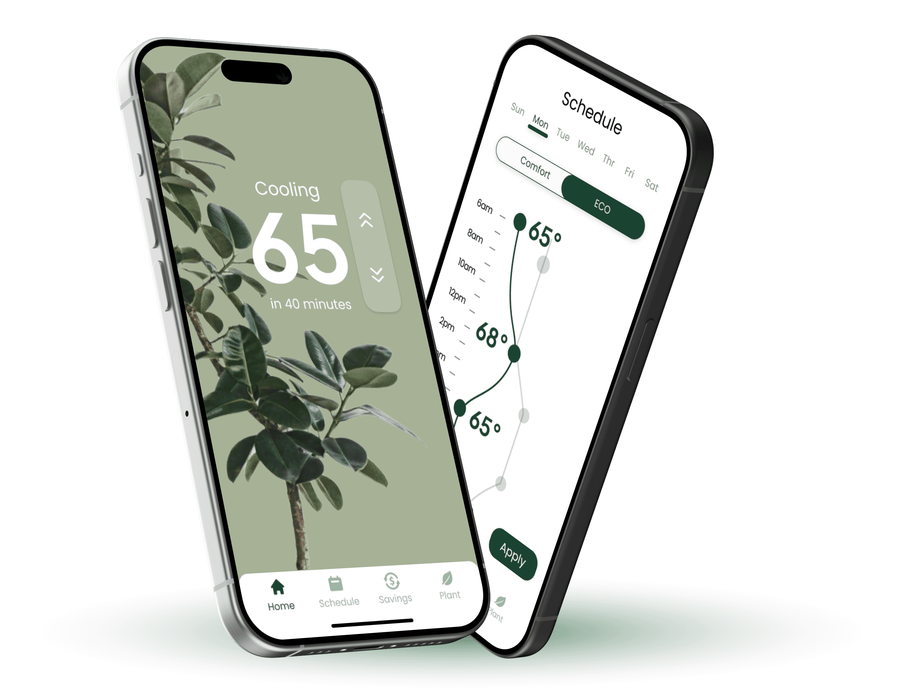
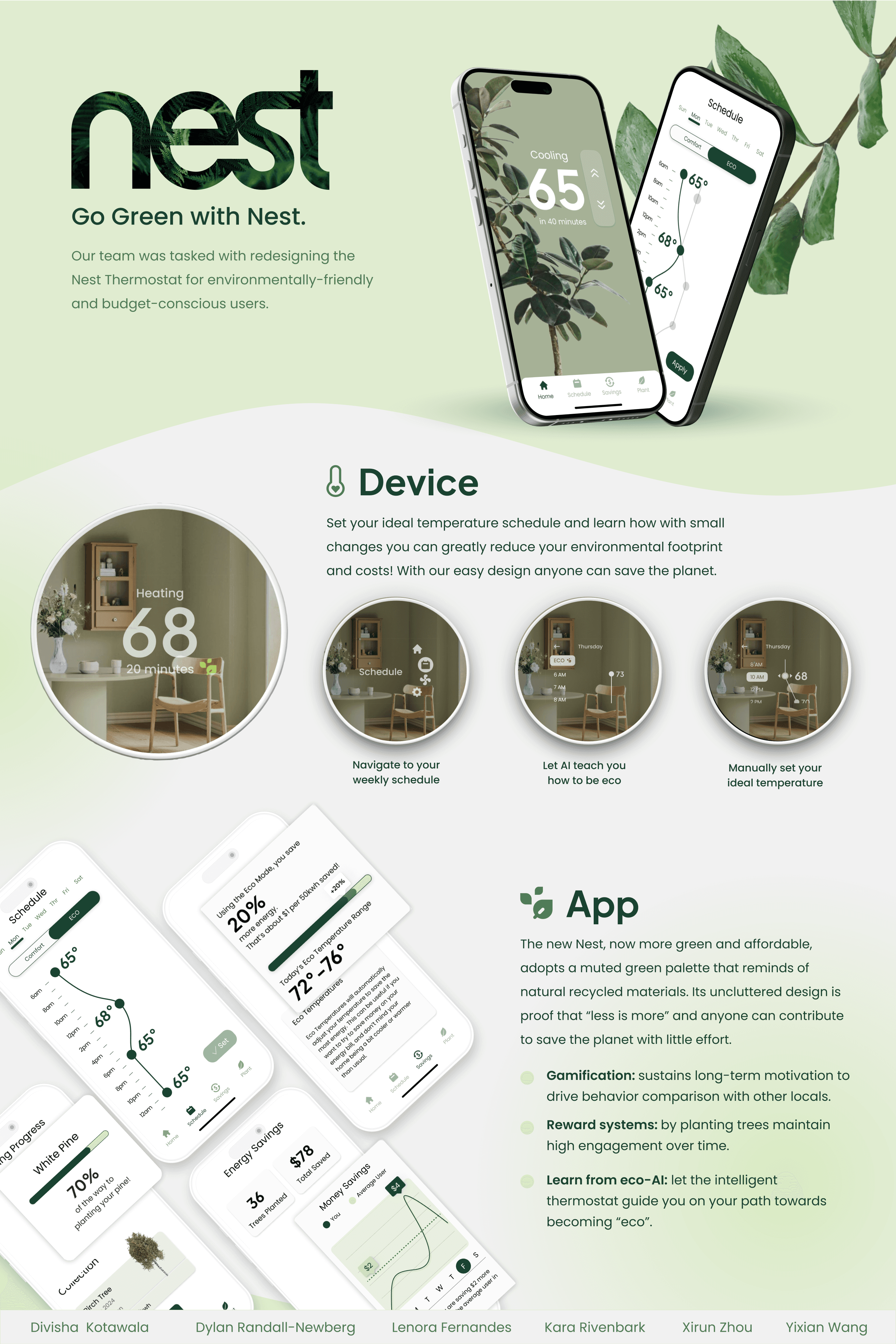
Google has decided to create a new version of the Nest Thermostat targeted towards environmentally-friendly and budget-conscious users. Our team is tasked with designing an embedded thermostat UI and iPhone app for this new thermostat.
Google has decided to create a new version of the Nest Thermostat targeted towards environmentally-friendly and budget-conscious users. Our team is tasked with designing an embedded thermostat UI and iPhone app for this new thermostat.
Learning to Design Around Constraints
We were tasked with using the same hardware as the original Nest Thermostat. This left limitations for our team to work around including:
Lack of Touchscreen: The Nest relies solely on a rotating ring and a touch bar on the right side of the ring for navigation.
Mirrored face and rectangular screen: The Nest uses a mirror to hide that the display screen is a rectangle, not a traditional circle.
Limited Color Options: The Nest’s mirrored display limits the amount of colors that can be seen.
Go Green With Nest
Our approach addresses rising energy costs, environmental concerns, and the demand for smart home solutions. The new Nest Thermostat empowers homeowners to maintain a sustainable, cost-effective temperature with ECO recommendations. It also offers energy savings tracking and a reforestation incentive to boost efficiency and environmental impact.
Our approach addresses rising energy costs, environmental concerns, and the demand for smart home solutions. The new Nest Thermostat empowers homeowners to maintain a sustainable, cost-effective temperature with ECO recommendations. It also offers energy savings tracking and a reforestation incentive to boost efficiency and environmental impact.
Presenting


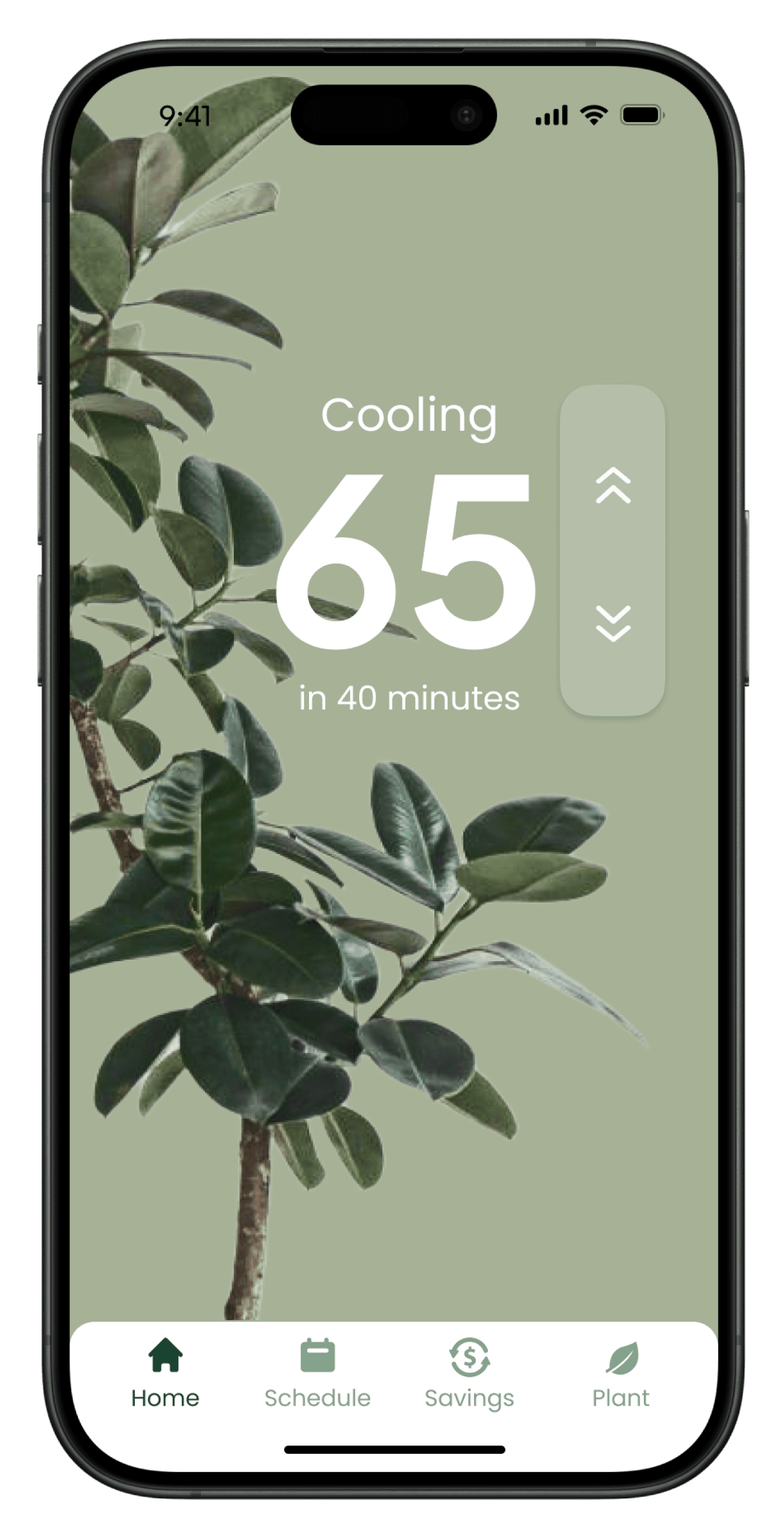

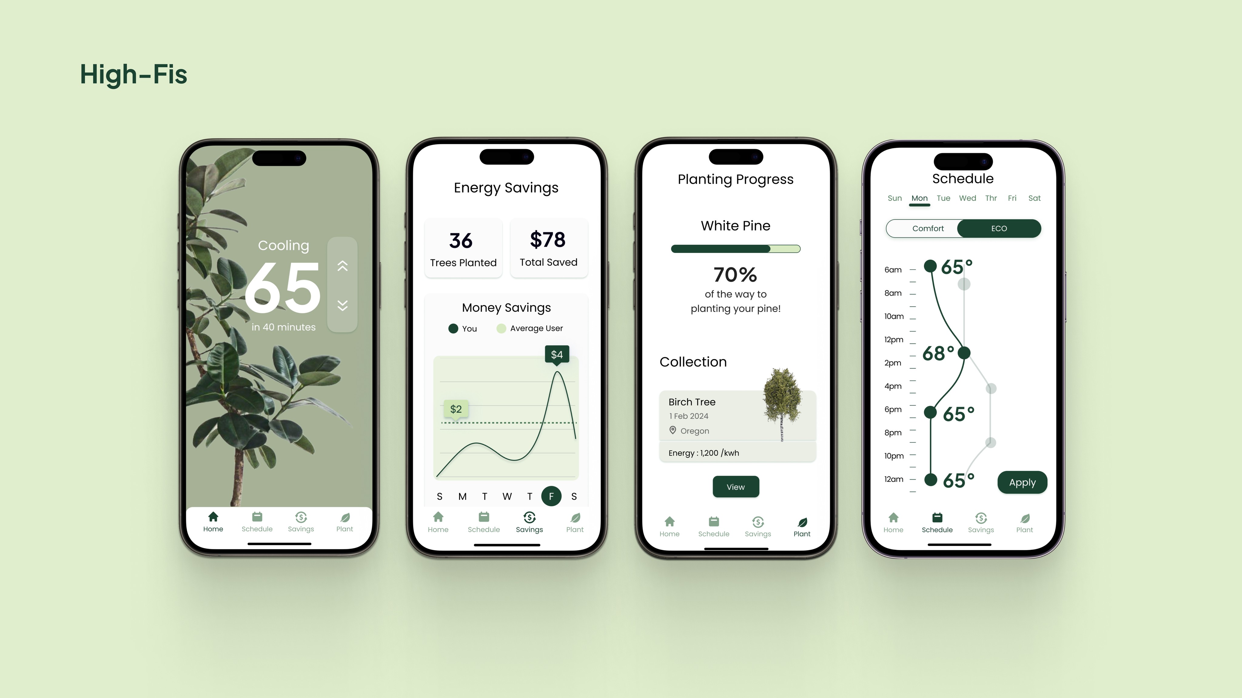
Home
Swipe to set your ideal temperature.
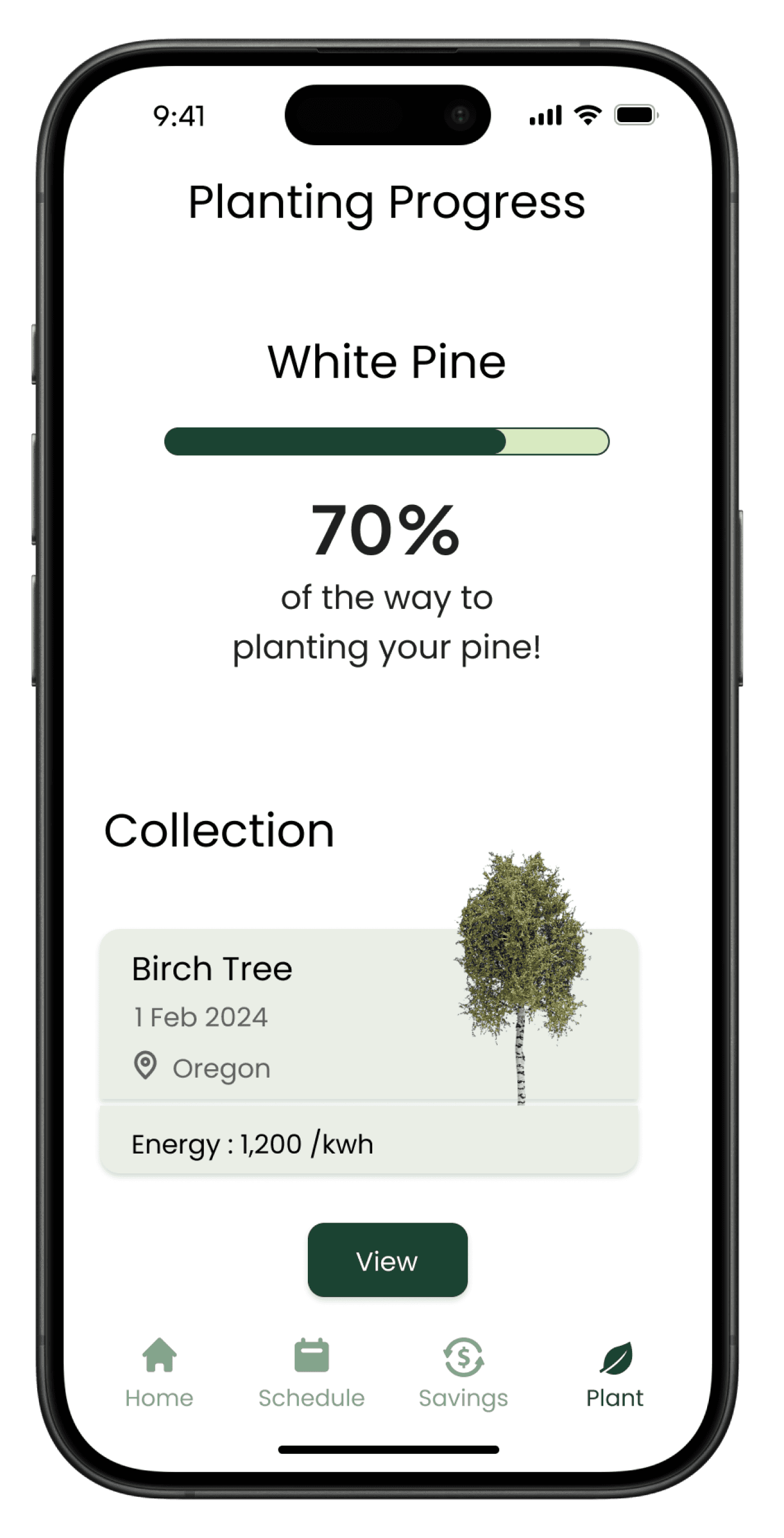

Plant
Plant real trees as you achieve energy-saving goals within the app. Nest will partner with a tree planting organization and notify you when a tree is planted on their behalf.
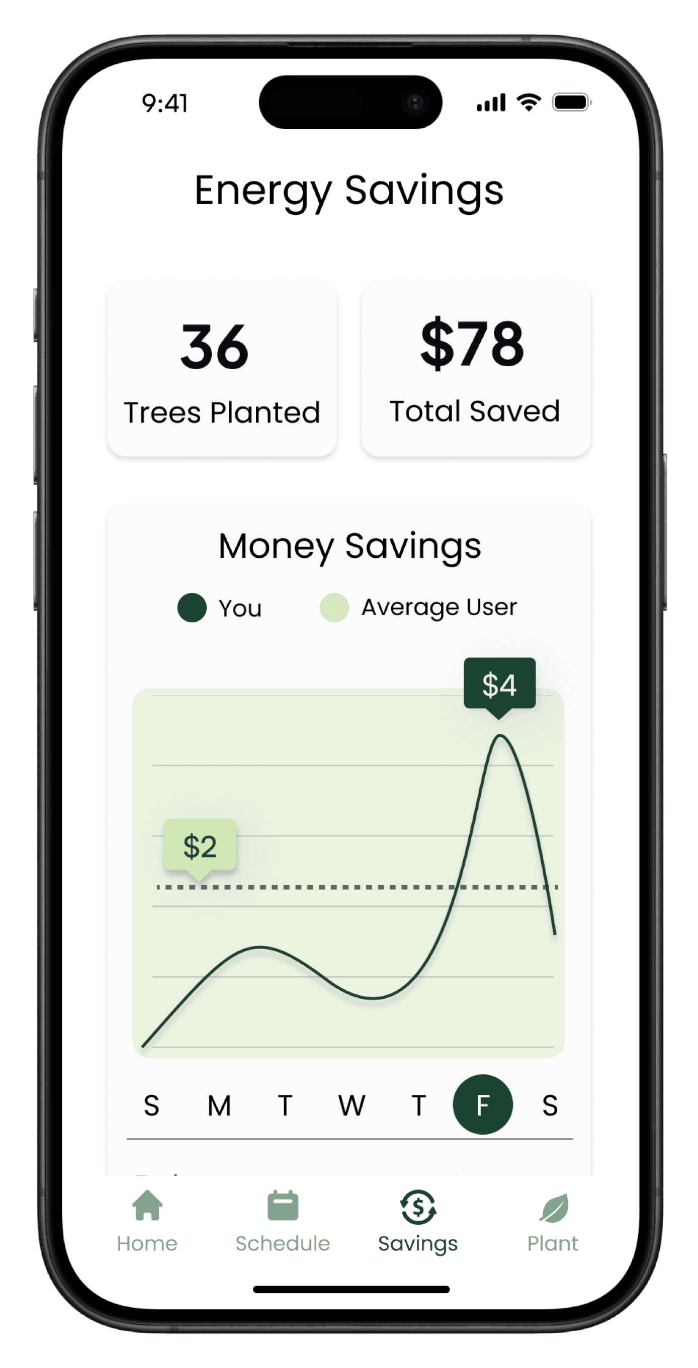

Savings
Track how much money you are saving on your energy bill each week. To gage your contribution, compare your savings with locals.
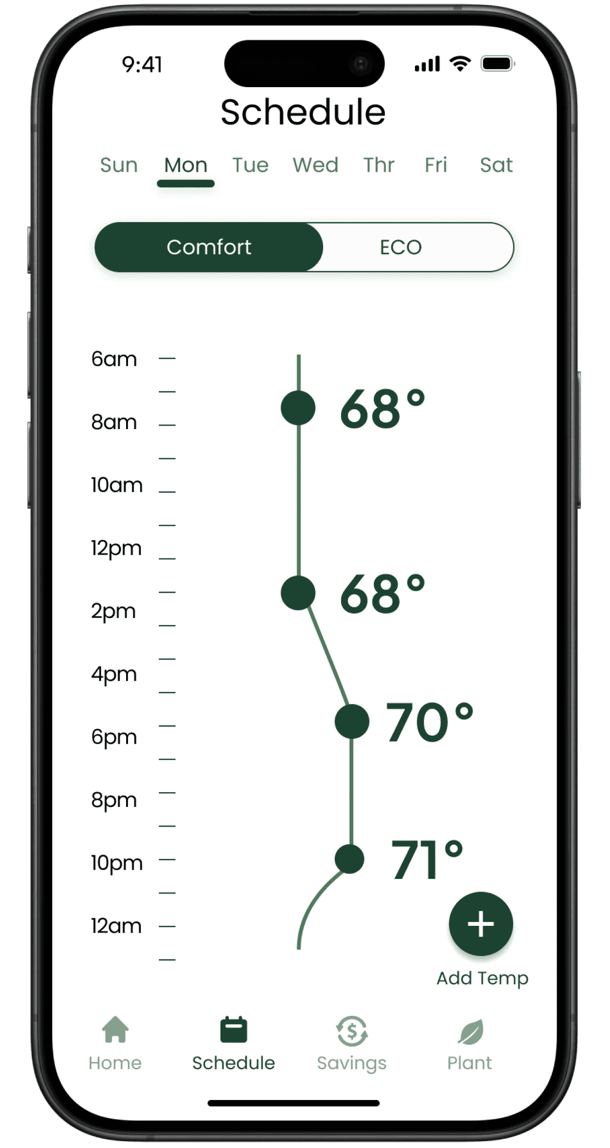

Comfort Schedule
Set your ideal temperatures on your comfort schedule by dragging a temperature left or right.
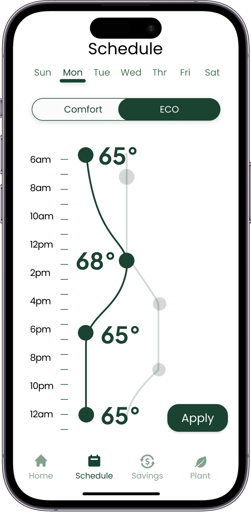

ECO Schedule
Switch to 'ECO' to automatically adjust your temperatures to be more eco-friendly, making it easy to save energy and money.
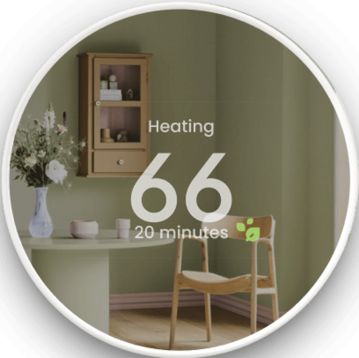

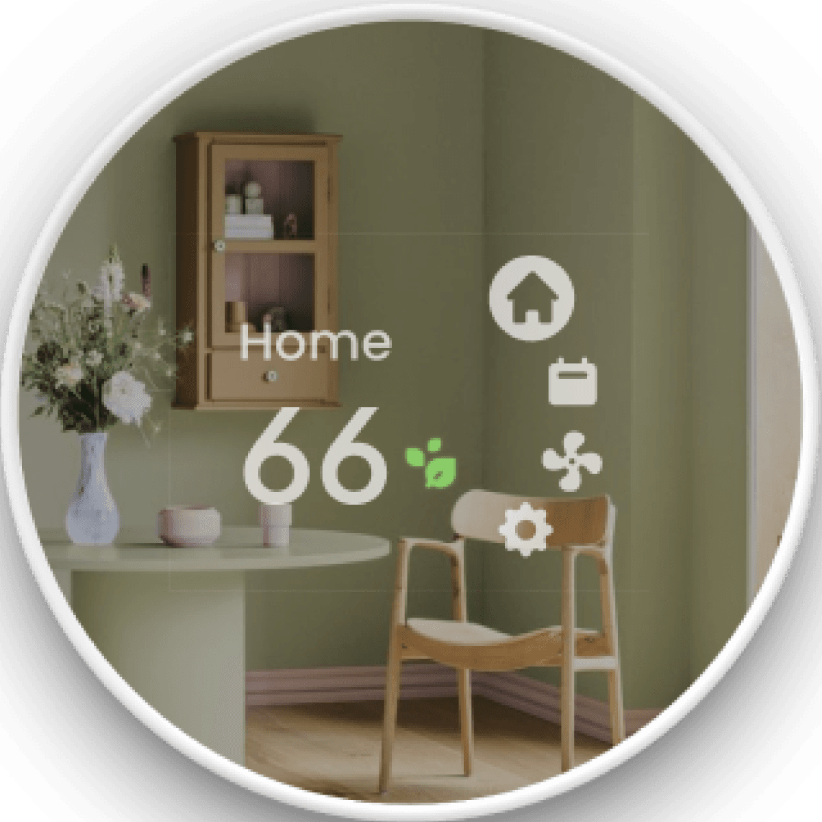

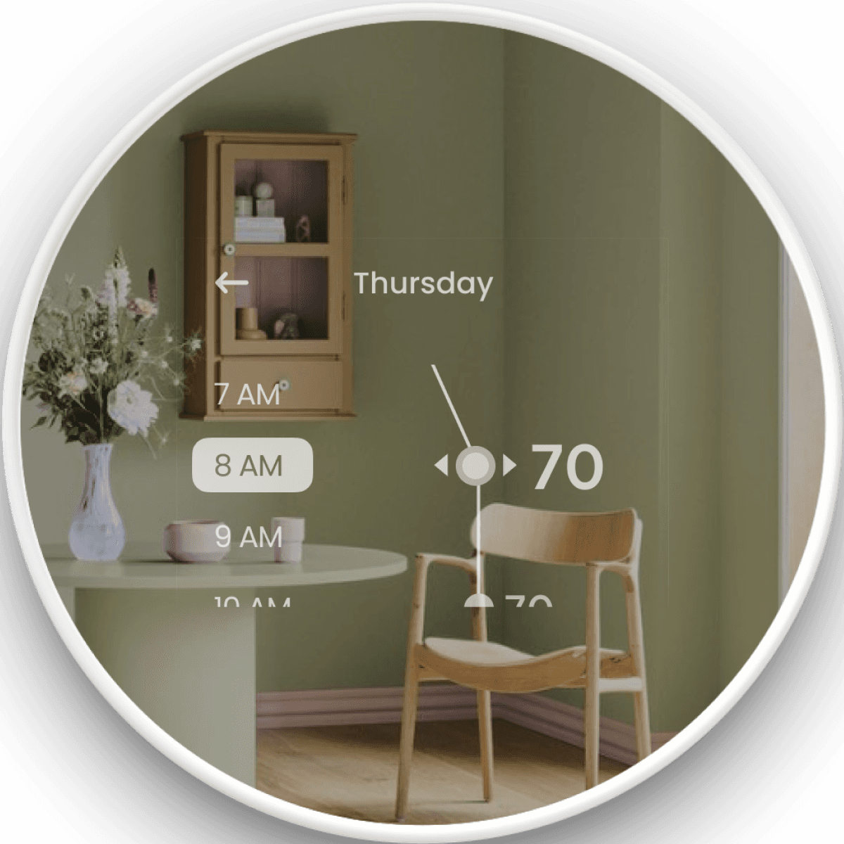

Device
The Green Nest Device empowers users to effortlessly adjust the temperature, manage their weekly schedule, control the fan, and customize thermostat settings, all from its intuitive home screen.
INDIVIDUAL PROPOSALS
Self Discovery and the Winning Proposals
Self Discovery and the Winning Proposals
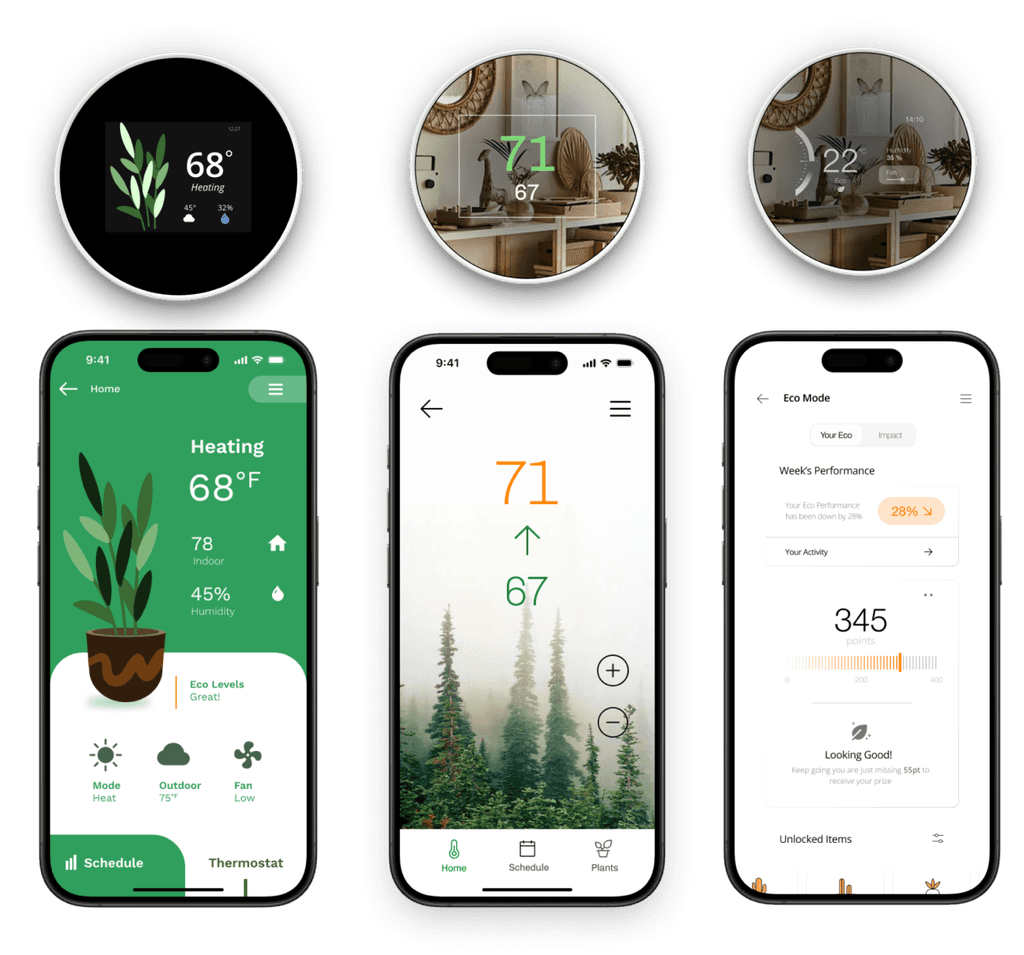
Before coming together as teams, students individually crafted app and device proposals for each of the Nest directions. Subsequently, as a class, we collectively voted for the most outstanding proposals to steer the direction of the final Nest thermostat.
Before coming together as teams, students individually crafted app and device proposals for each of the Nest directions. Subsequently, as a class, we collectively voted for the most outstanding proposals to steer the direction of the final Nest thermostat.
Winning Proposals


My Proposals
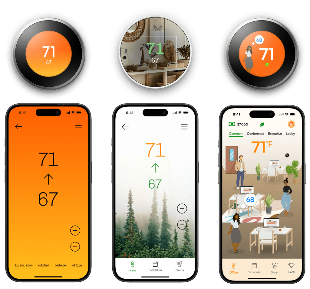


The three directions were:
High End and Innovative
Green and Affordable
Cheerful and Friendly for an office setting
Our team was randomly assigned the Green and Affordable direction at the end of this process.
The three directions were:
High End and Innovative
Green and Affordable
Cheerful and Friendly for an office setting
Our team was randomly assigned the Green and Affordable direction at the end of this process.
TIMELINE
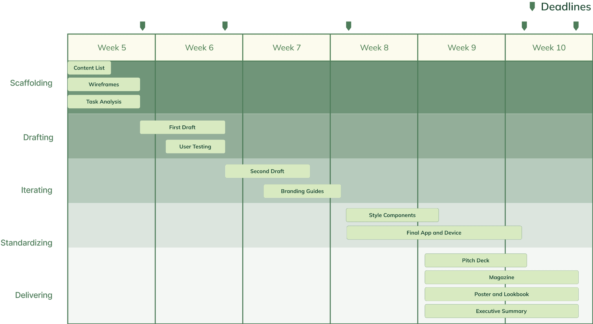
Our 6 Week Structure
Our 6 Week Structure
During week 4 of the 10-week course, our final teams were assigned to develop the Green and Affordable app and device. My team and I mapped out every step and deadline, ensuring clear responsibilities and keeping us on track throughout the project.
During week 4 of the 10-week course, our final teams were assigned to develop the Green and Affordable app and device. My team and I mapped out every step and deadline, ensuring clear responsibilities and keeping us on track throughout the project.

RESEARCH
Identifying the Key Features of Our App
Identifying the Key Features of Our App
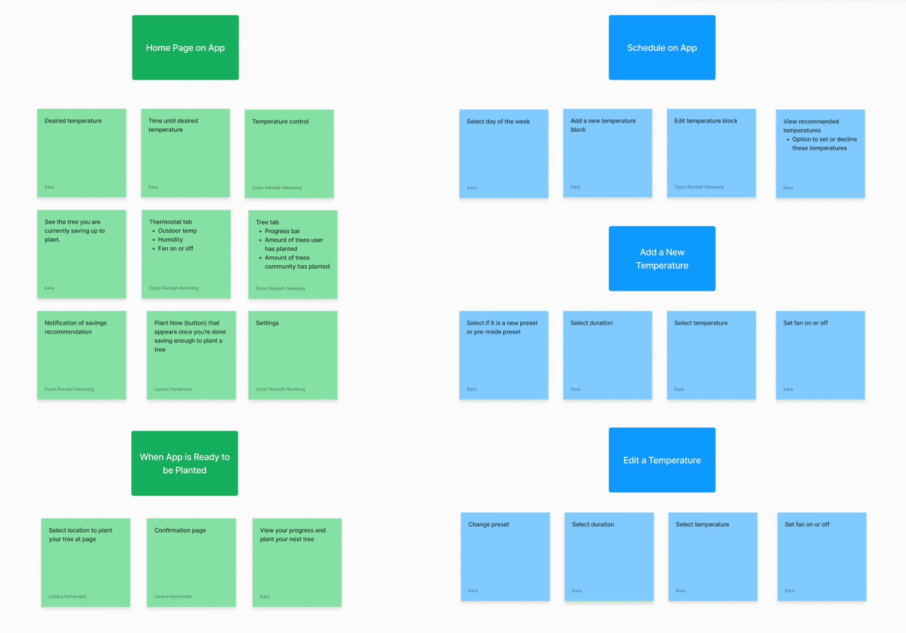
Our design process kicked off with thorough research into the features of existing thermostats. We then conducted surveys to gauge people's preferences for an eco-conscious thermostat. This approach, focusing on understanding the product and user preferences, forms the foundation of all my design projects, ensuring targeted and user-centric designs.
Our design process kicked off with thorough research into the features of existing thermostats. We then conducted surveys to gauge people's preferences for an eco-conscious thermostat. This approach, focusing on understanding the product and user preferences, forms the foundation of all my design projects, ensuring targeted and user-centric designs.


Key Insights!
Key Insights!
From our research, we found that green users would like to make real environmental impact by planting trees as they achieve energy-saving milestones within the app. They value seeing their trees planted in real life and tracking the number of trees they've planted.
Similarly, affordable users are keen on monitoring their cost savings as they decrease energy expenses. To effectively illustrate this, we opted to compare users' energy savings with locals, fostering sustained motivation to reduce energy consumption in the long term.
IDEATION
Drafting Our App and Device
Drafting Our App and Device
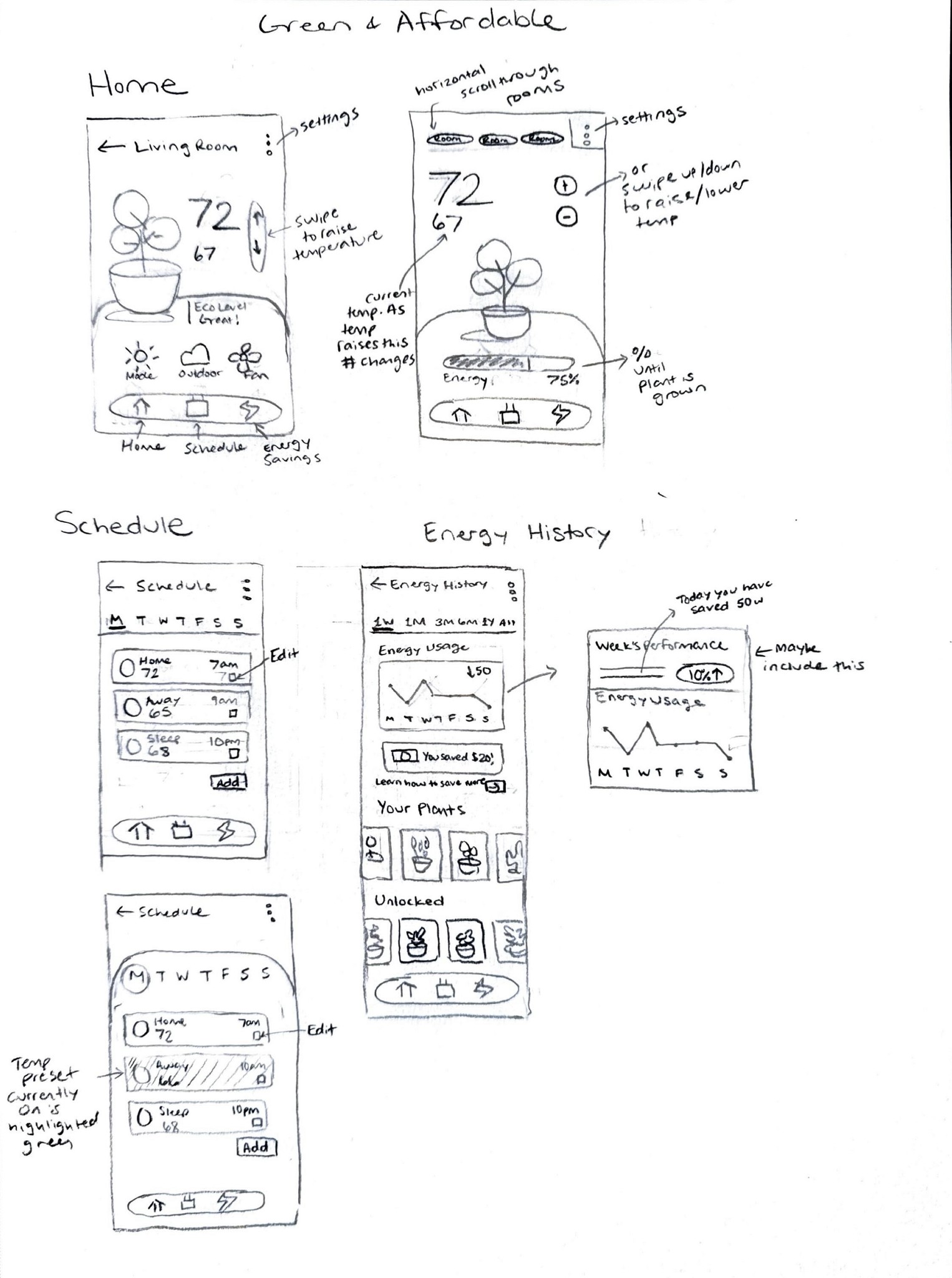
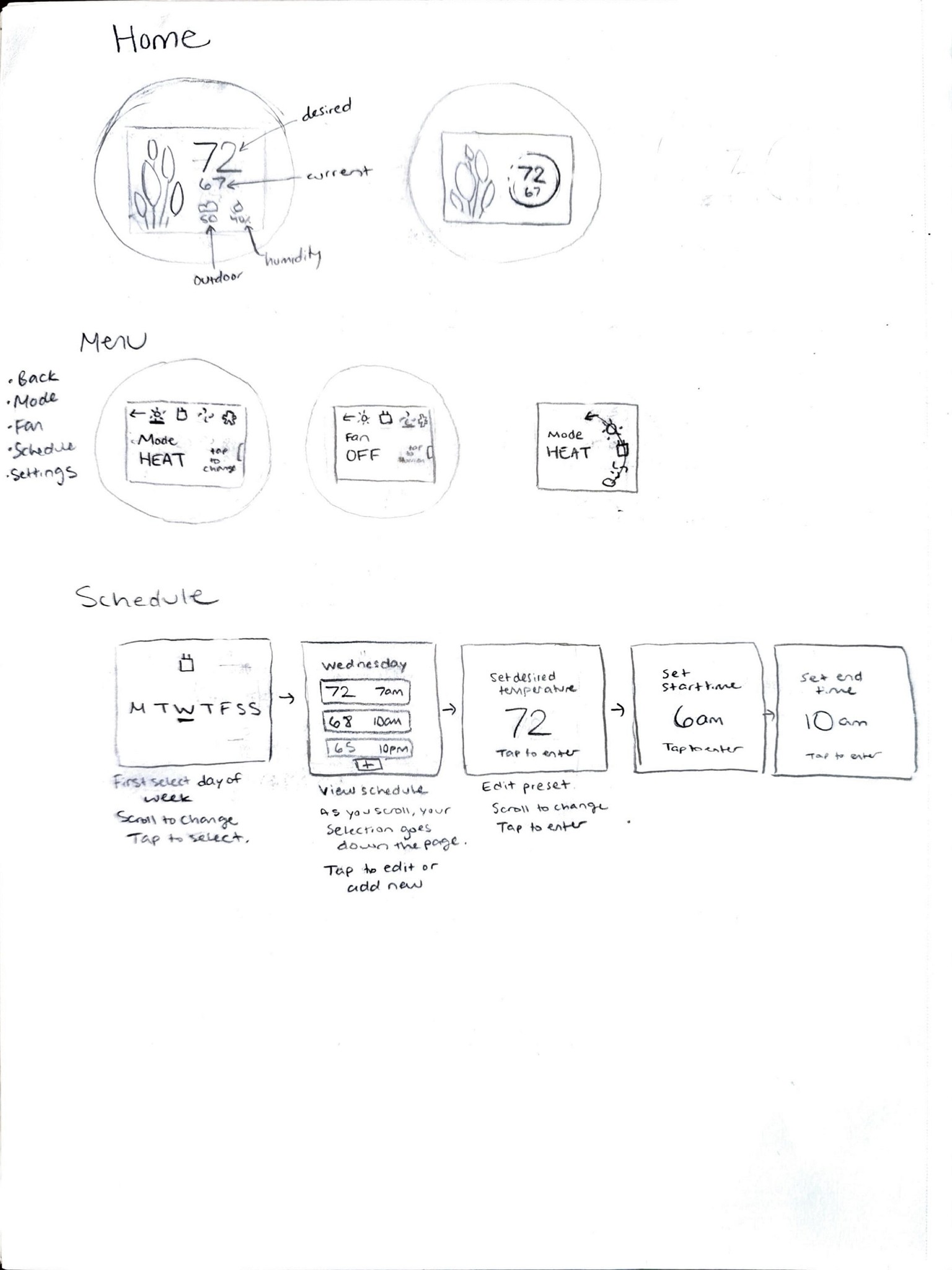
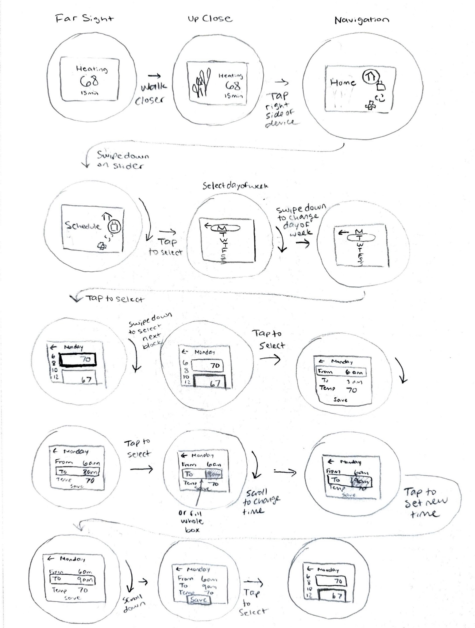
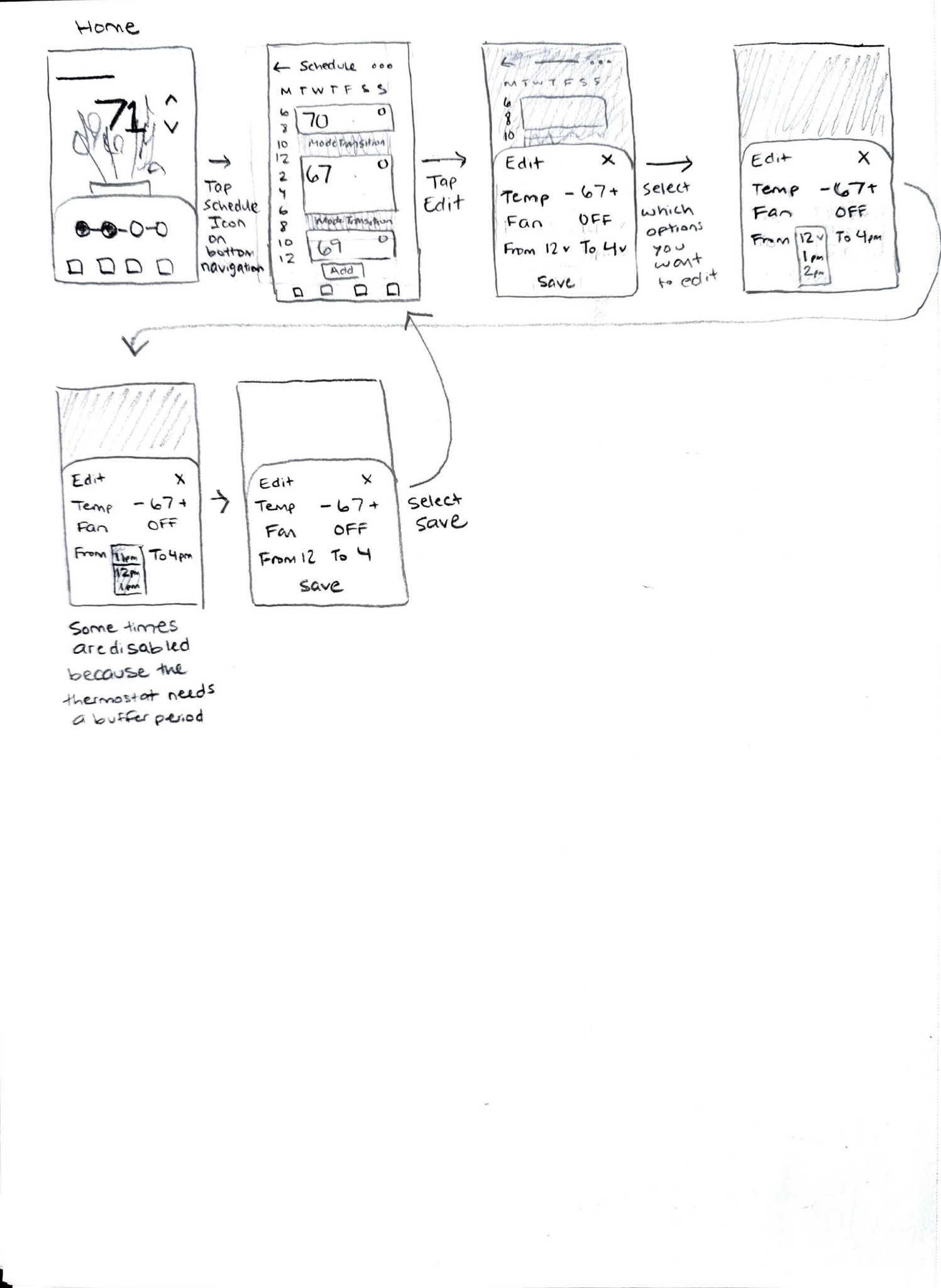
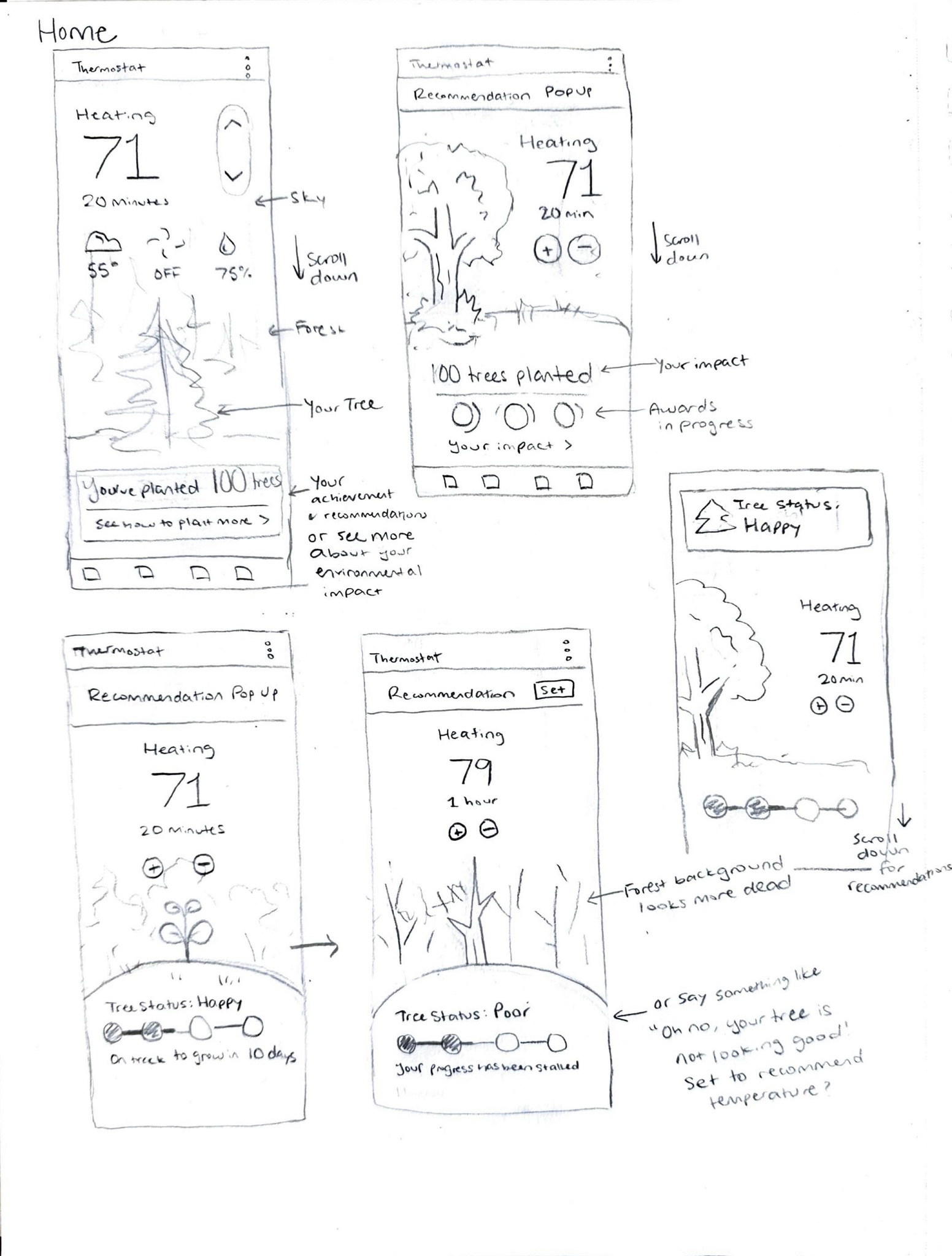
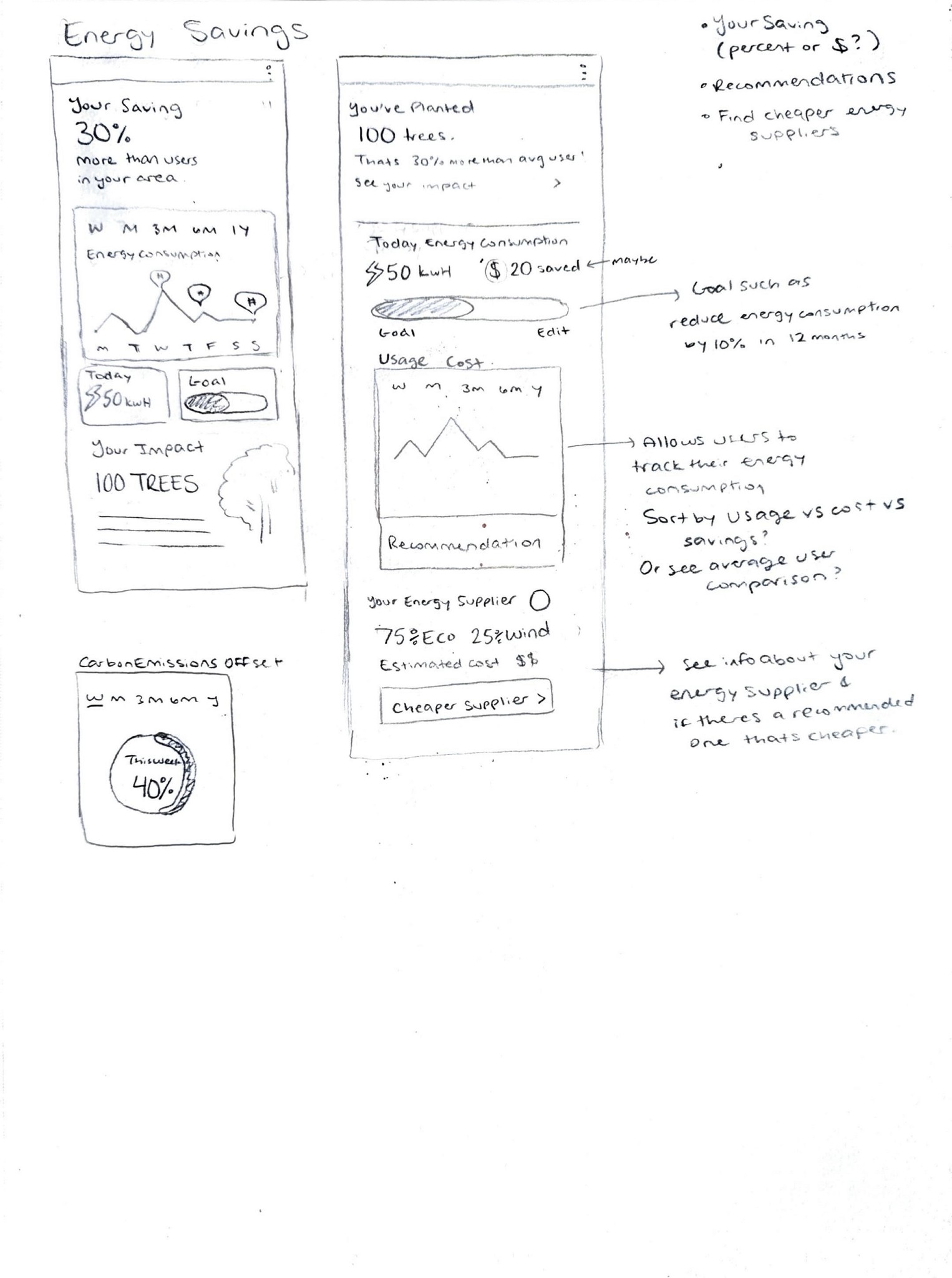
Our team initiated the process by brainstorming and sketching ideas for pages and features to incorporate into the final app.
Our team initiated the process by brainstorming and sketching ideas for pages and features to incorporate into the final app.






USABILITY TESTING
Assessing the Usability of our First Schedule Flow
Assessing the Usability of our First Schedule Flow
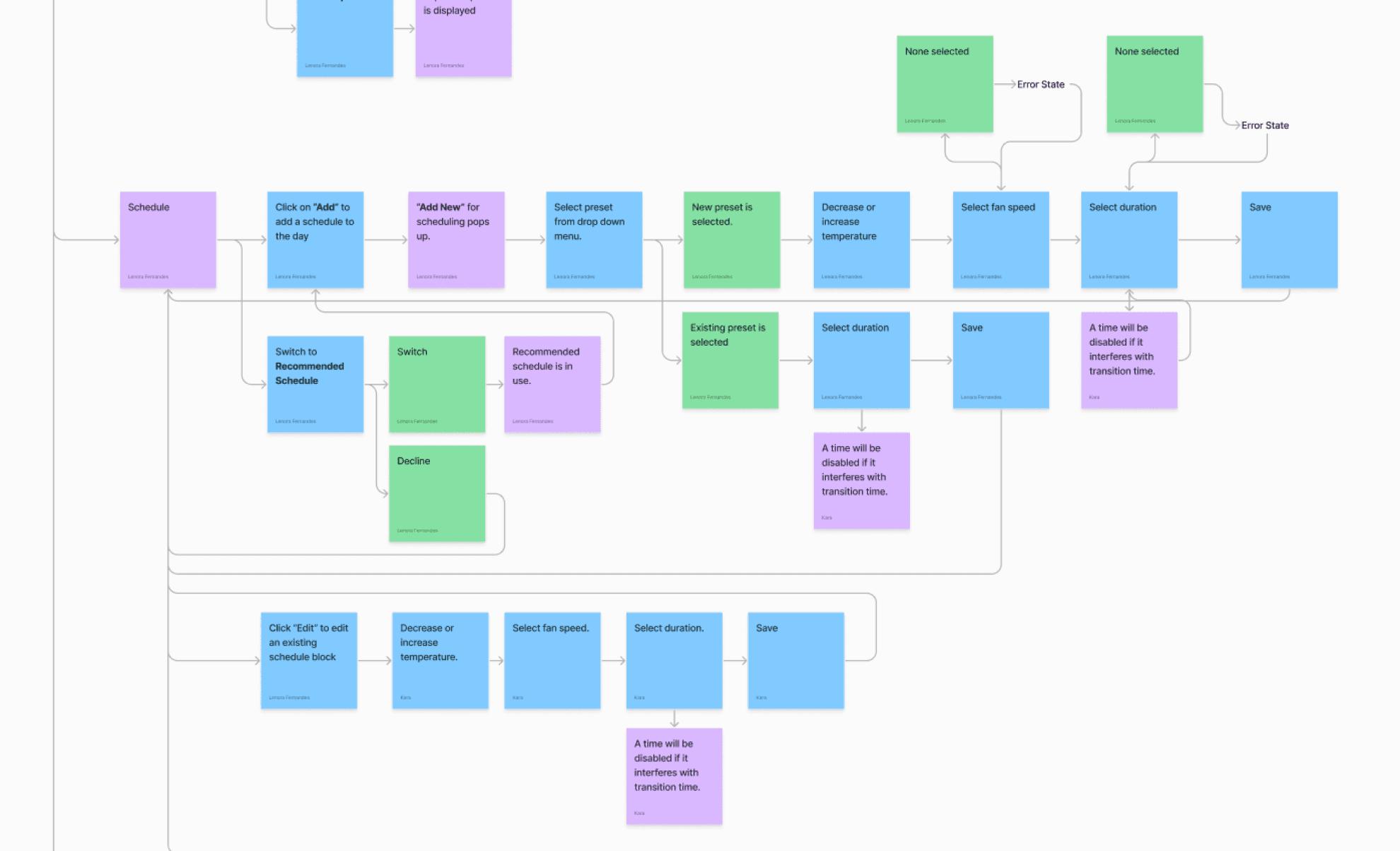
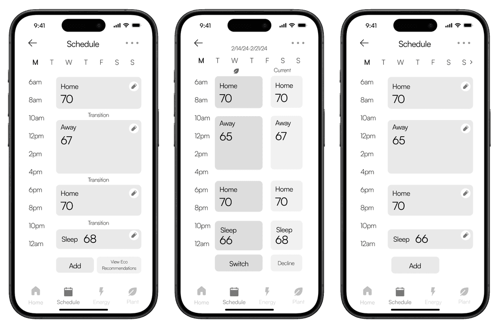
Early in our design process, our team conducted our first round of usability testing to gather feedback before proceeding with development. This step is crucial for validating task flows and app functionality, allowing us to refine wireframes and information architecture based on invaluable user input.
Early in our design process, our team conducted our first round of usability testing to gather feedback before proceeding with development. This step is crucial for validating task flows and app functionality, allowing us to refine wireframes and information architecture based on invaluable user input.

Average Sufficiency Score
Average Sufficiency Score
*calculated at 95% confidence
*calculated at 95% confidence
App
App
12 User Tests
12 User Tests
57.0%
57.0%
87.0%
87.0%
72%
10 User Tests
10 User Tests
Device
Device
78.5%
78.5%
93.5%
93.5%
86%
Arden
Doesn’t look like a thermostat app. The home page is overwhelming and fan and humidity unnecessary.
Doesn’t look like a thermostat app. The home page is overwhelming and fan and humidity unnecessary.
Tan
Thinks the app looks cheap due to icons and tree illustration, and the device is confusing because the wrong things are emphasized.
Thinks the app looks cheap due to icons and tree illustration, and the device is confusing because the wrong things are emphasized.
Afiya
The lack of opacity changes in the device led to an assumption of tapping instead of scrolling.
The lack of opacity changes in the device led to an assumption of tapping instead of scrolling.
Mia
The home screen is too clustered. I didn’t know how to adjust the temperature, or if the eco recommendations were switched.
The home screen is too clustered. I didn’t know how to adjust the temperature, or if the eco recommendations were switched.
Design Pivot!
Design Pivot!
After receiving feedback from user testers, we discovered that many found our thermostat app design to be overwhelming and inconsistent. In response, our team made significant adjustments by simplifying our design, increasing white space, and introducing muted green tones to align with our branding.
After receiving feedback from user testers, we discovered that many found our thermostat app design to be overwhelming and inconsistent. In response, our team made significant adjustments by simplifying our design, increasing white space, and introducing muted green tones to align with our branding.
APP DESIGN PROCESS
Our UI Design Skills Grew Immensely
Our UI Design Skills Grew Immensely
Challenges in Designing the Schedule
Challenges in Designing the Schedule
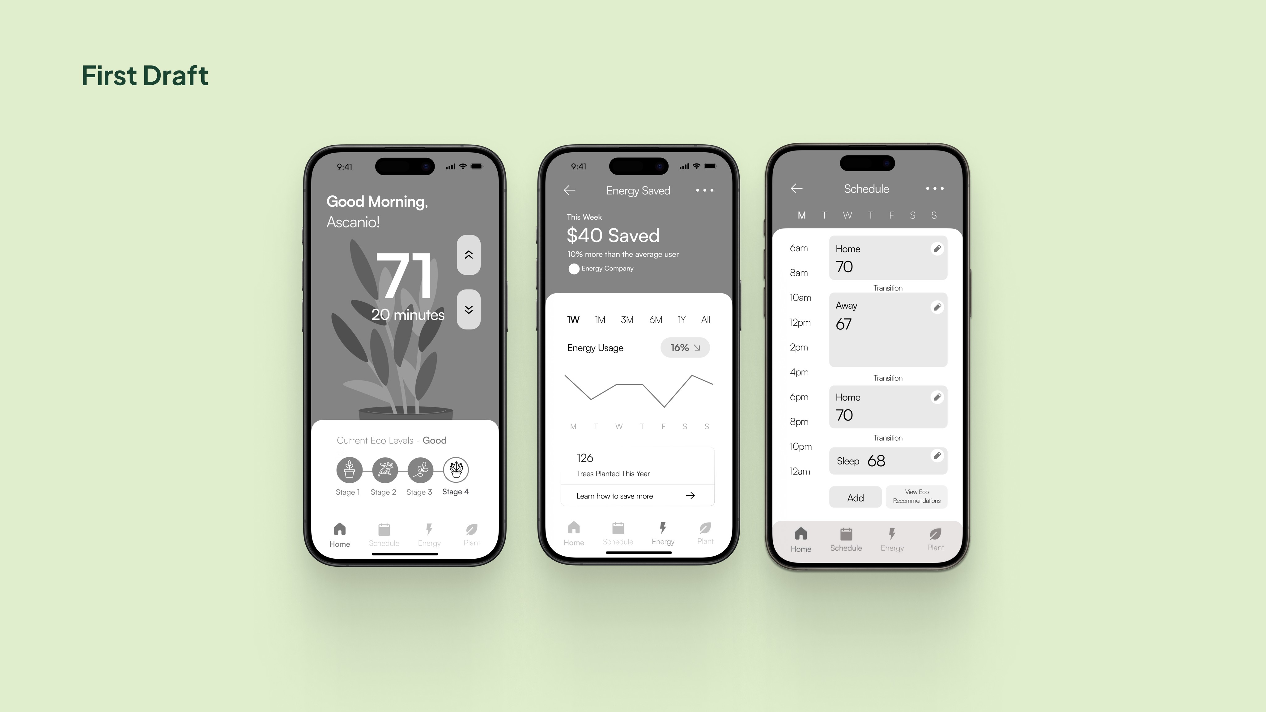
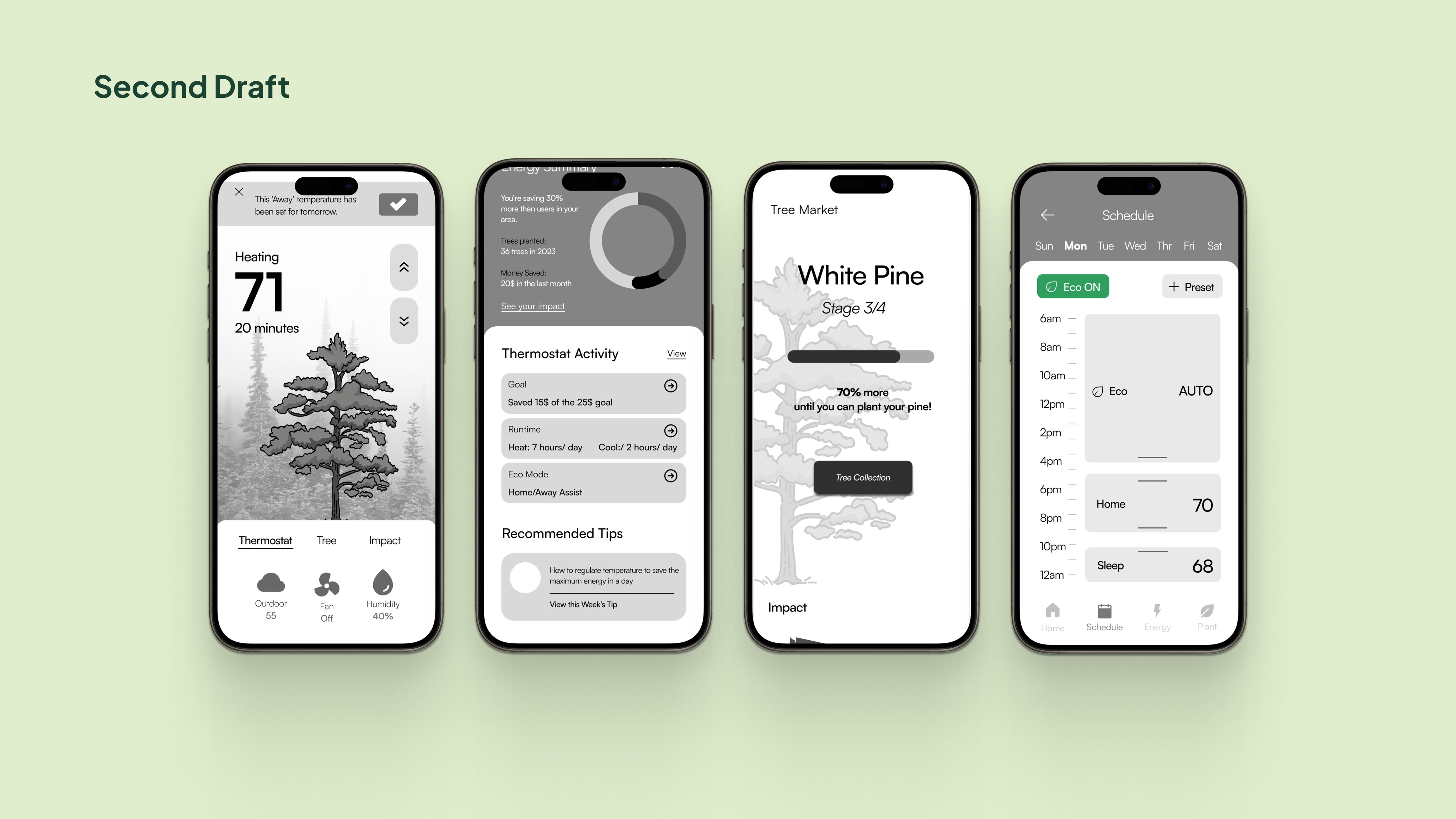
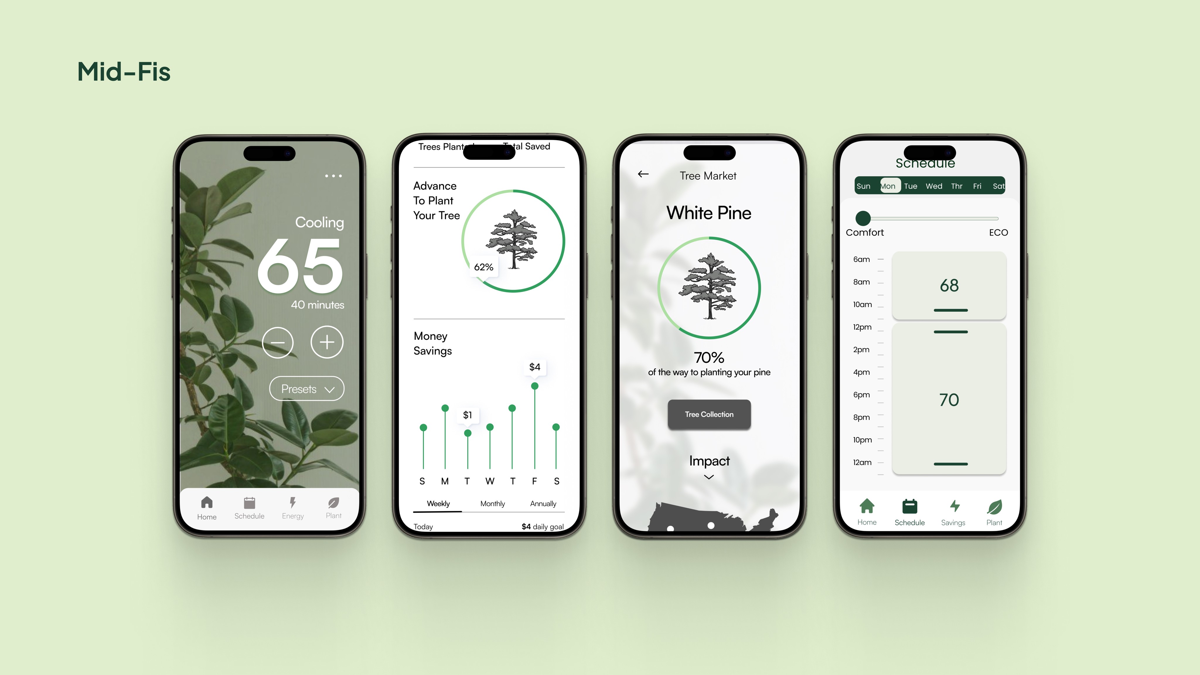
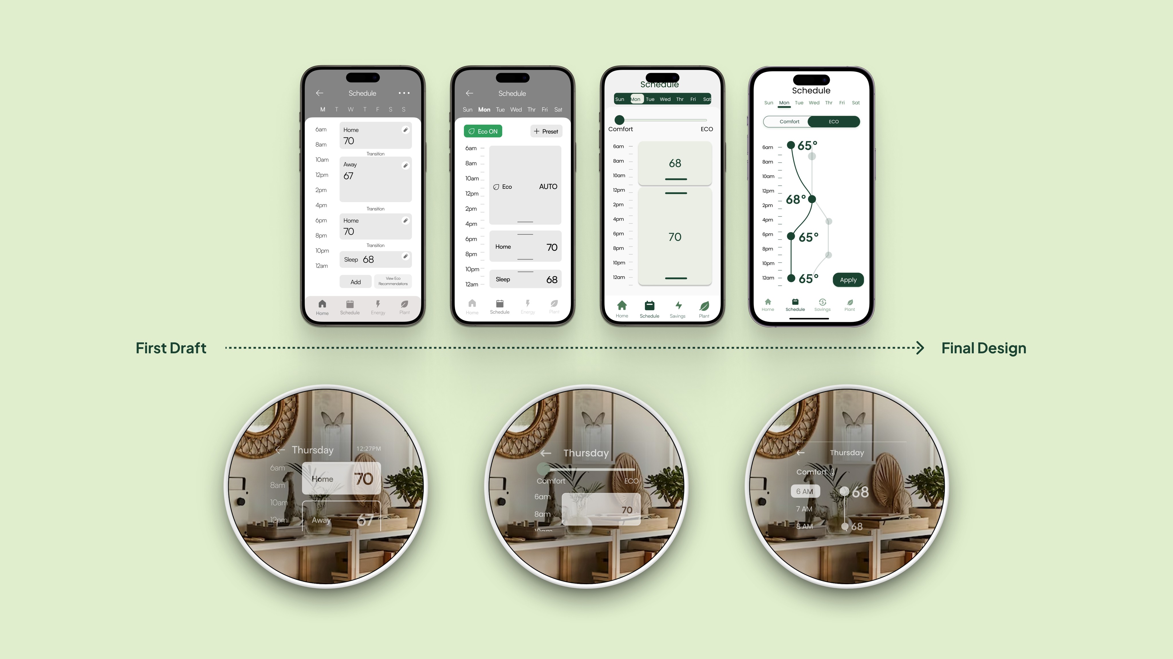
One of the most challenging aspects of our design process centered around creating the weekly schedule for both the app and thermostat device.
Initially, we planned to utilize temperature blocks for each hour, enabling users to set presets for home, away, and sleep temperatures. However, to enhance eco-friendliness, we introduced a comfort-eco slider. This feature allowed users to use comfort mode to set preferred temperatures. Then, users have the option to use the slider to adjust eco-friendliness levels to regulate energy consumption. Later, we changed the slider into a toggle to lessen complexity in our design.
Throughout this project, our design evolved week by week, steadily improving in clarity, usability, and visual appeal. This experience taught me the importance of perseverance in overcoming obstacles and the necessity of problem-solving when features didn't perform as intended.






Last Minute Changes
Last Minute Changes
A week before our pitch, Professor suggested removing the block scheduling system to set us apart from competitors and improve user experience. This required significant changes, yet Lenora and Dylan proposed a solution: allowing users to drag temperature dots to adjust settings. They implemented this idea in the app, while Divisha and I implemented it into the device.
A week before our pitch, Professor suggested removing the block scheduling system to set us apart from competitors and improve user experience. This required significant changes, yet Lenora and Dylan proposed a solution: allowing users to drag temperature dots to adjust settings. They implemented this idea in the app, while Divisha and I implemented it into the device.
DEVICE DESIGN PROCESS
Designing Around Limitations
Designing Around Limitations
I was the lead designer of the thermostat device. The creation of the device involved many limitations including a lack of touchscreen, a rectangular display, and a mirrored screen that limited our colors to black and white. This posed many challenges with our design, but the most difficult part was creating consistency between default, focus, and active states. This was challenging because we had many components within our thermostat, all of which behaved differently. Through team collaboration, many whiteboard sessions, and testing our device flow with users, we came to these designs in our final device.
I was the lead designer of the thermostat device. The creation of the device involved many limitations including a lack of touchscreen, a rectangular display, and a mirrored screen that limited our colors to black and white. This posed many challenges with our design, but the most difficult part was creating consistency between default, focus, and active states. This was challenging because we had many components within our thermostat, all of which behaved differently. Through team collaboration, many whiteboard sessions, and testing our device flow with users, we came to these designs in our final device.
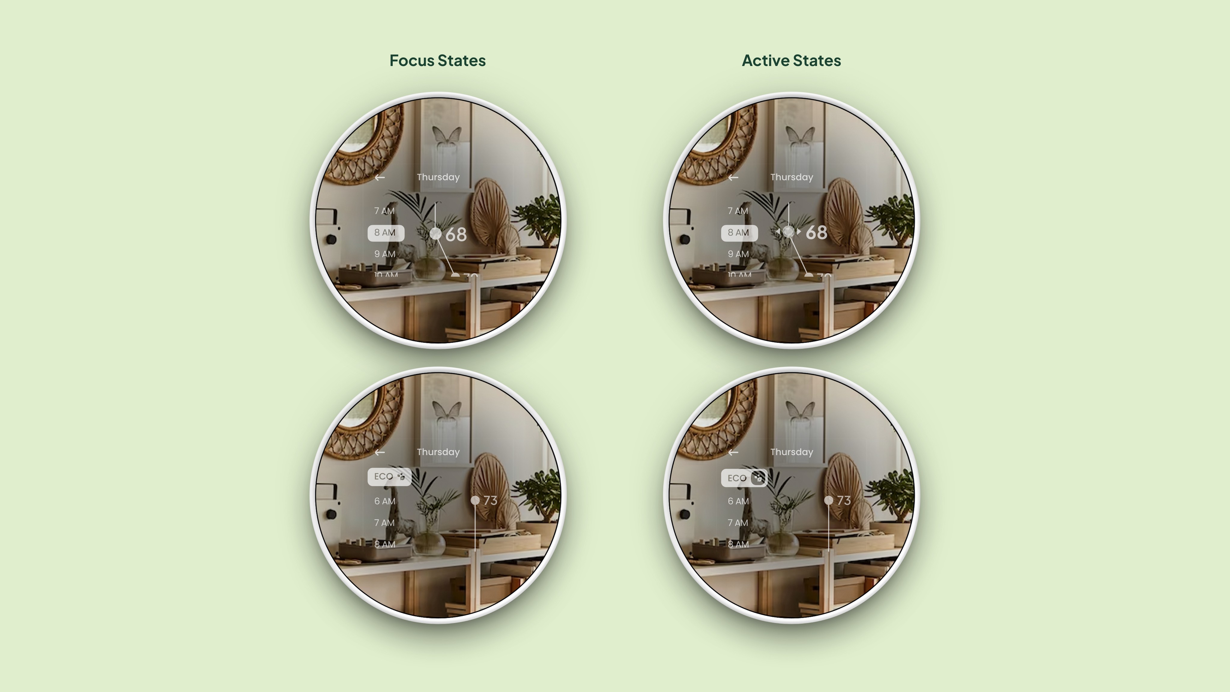

Navigating design constraints for the first time, I led this aspect of the project, honing my design thinking skills in the process. Taking charge of testing our device with each design iteration, I proactively sought to understand user interactions and enhance the overall experience, driving clarity and usability forward with our designs.
Navigating design constraints for the first time, I led this aspect of the project, honing my design thinking skills in the process. Taking charge of testing our device with each design iteration, I proactively sought to understand user interactions and enhance the overall experience, driving clarity and usability forward with our designs.
Watch This Walkthrough of Our Device Prototype
Watch This Walkthrough of Our Device Prototype
REFLECTION
But Most of All I Learned How to Work in and Manage a Team…
But Most of All I Learned How to Work in and Manage a Team…
As a Team
As a Team
How to communicate within a team of different cultures and beliefs to foster a team of respect, open communication, and understanding.
Maintaining a task management board enables the team can monitor task assignments, progress, and anticipate completion timelines.
How to design with restraints and limitations.
To adapt to rapid design changes and suggestions from the manager.
How to pitch to a professional client, and the importance of showing usability testing data, validation behind decisions, and business metrics.
About Myself
About Myself
My dedication to completing tasks and setting goals led me to step up as a leader in our team. In this capacity, I organized our workflow, ensured that deadlines were met, and defined tasks for each member, and coordinated weekly team meetings to keep everyone aligned and focused.
My preference towards independent work initially propelled me to complete tasks solo rather than leveraging the strengths of my team members. Yet while working in a team environment, I came to realize the crucial role of communication and collaboration in project success.
Looking ahead, I am committed to refining my approach by actively listening to team members, embracing diverse perspectives, and fostering a collaborative environment to enhance project outcomes and personal growth.


KARA RIVENBARK
KARA RIVENBARK
KARA RIVENBARK