
Role
Product Design Intern
Skills and Tasks
Accessibility
User Research
Instructional Design
Figma Component Design
Conference Branding
Cross-team Collaboration
Tools
Figma
Duration
June 2025 - August 2025
Embedding Accessibility into Design
As a Design Systems intern at State Farm, my main project focused on a big challenge: embedding accessibility into the UX design process. I led user research to uncover current gaps, then translated findings into actionable solutions. The outcome was a structured approach to make accessibility a consistent practice, including training resources, a simplified guideline system, and a framework for integrating accessibility into every stage of the design process.
Alongside this project, I also contributed to the design system by building components, designed branding concepts for two internal conferences (with my design selected by senior designers to move forward), and participated in Hack Day where my team won first place in the low-code category and advanced our idea into development.
Jump to a Project
Accessibility

Surveying Designers
Before I joined, 85 out of 120 designers responded to an enterprise survey, which is a strong signal that designers cared about solving accessibility challenges. I synthesized the results in FigJam, clustering related responses with sticky notes, and tested AI's ability to surface findings compared to my own. From this process, I surfaced four key themes:
6 Interviews with Designers
The survey gave us a broad view of accessibility challenges, but I wanted to understand how it fit into designers’ processes. I worked with the enterprise research team to refine an interview guide and conducted 1:1 interviews across teams, which uncovered deeper insights into daily workflows, pain points, and opportunities to better embed accessibility.


Learning First-Hand
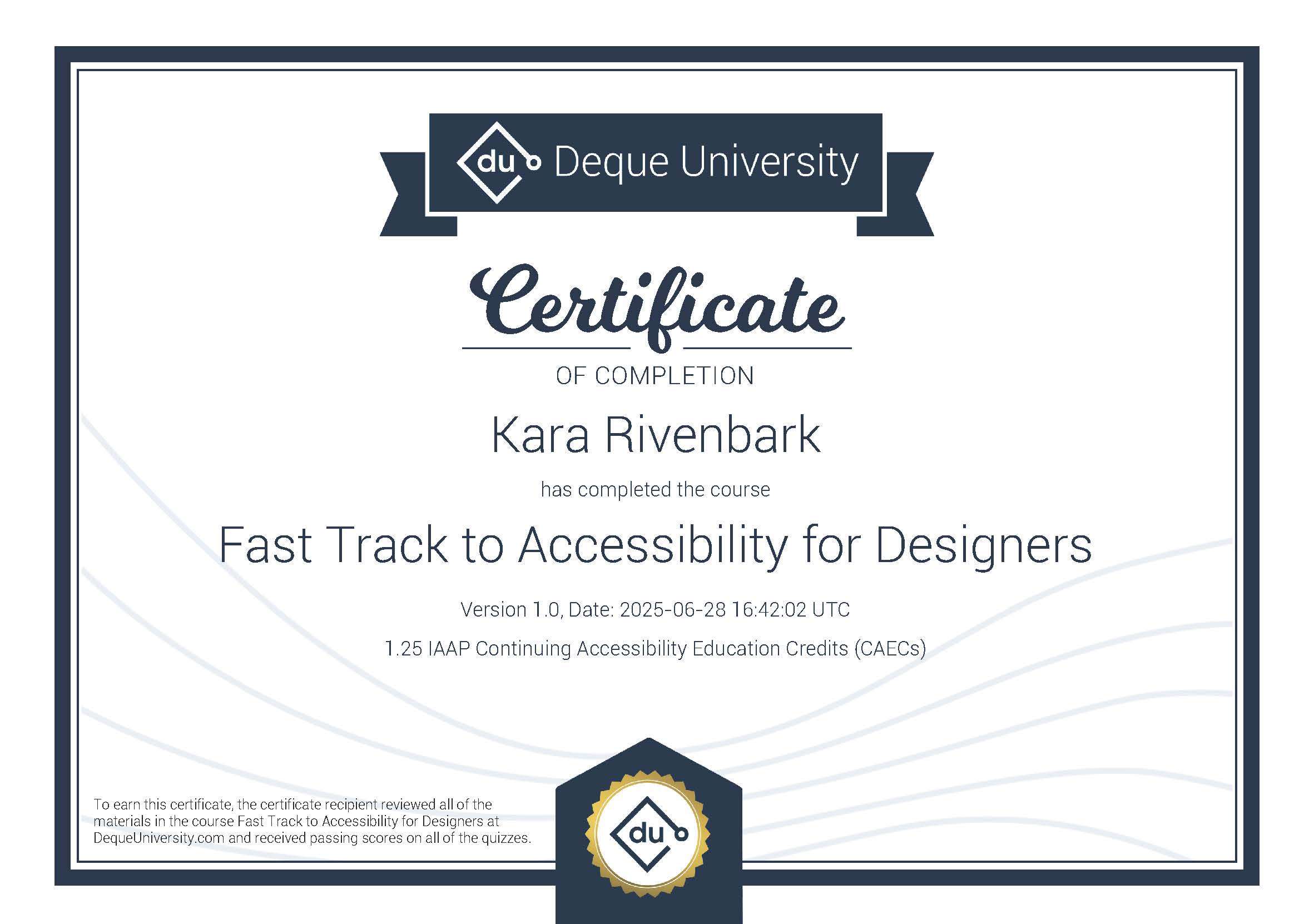
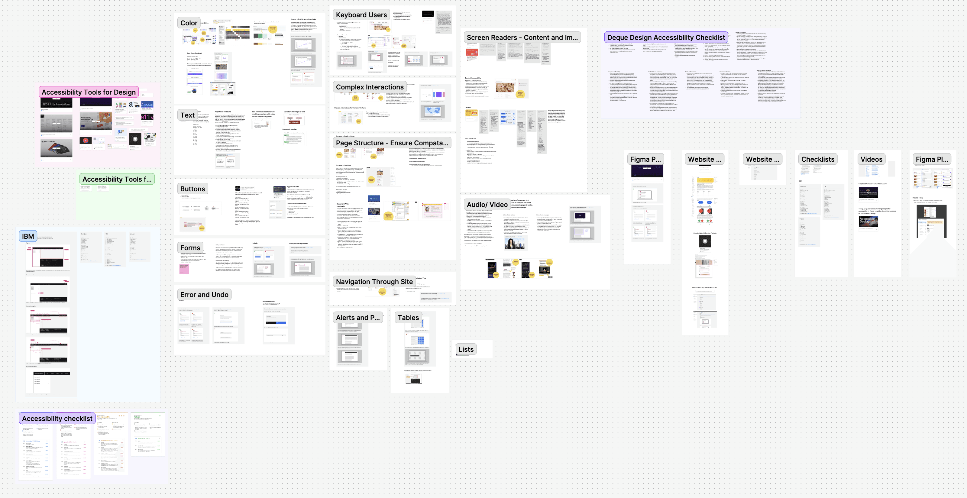
When I started, I only knew accessibility at a surface level. To design credible solutions, I dove in and became certified in Deque’s Fast Track to Accessibility for Designers, read articles by experts like Stephanie Walter and NN/g, and researched competitor design systems.
Making Accessibility Accessible: Guidelines for Designers
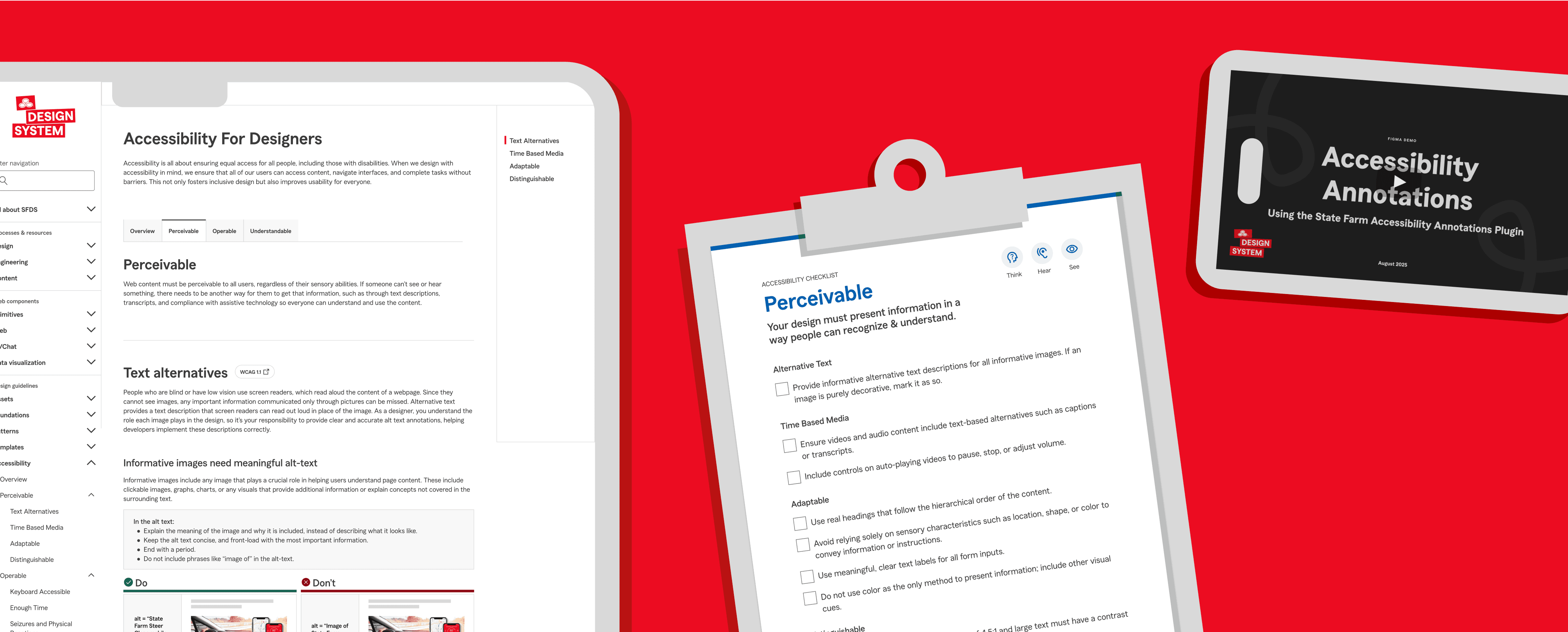
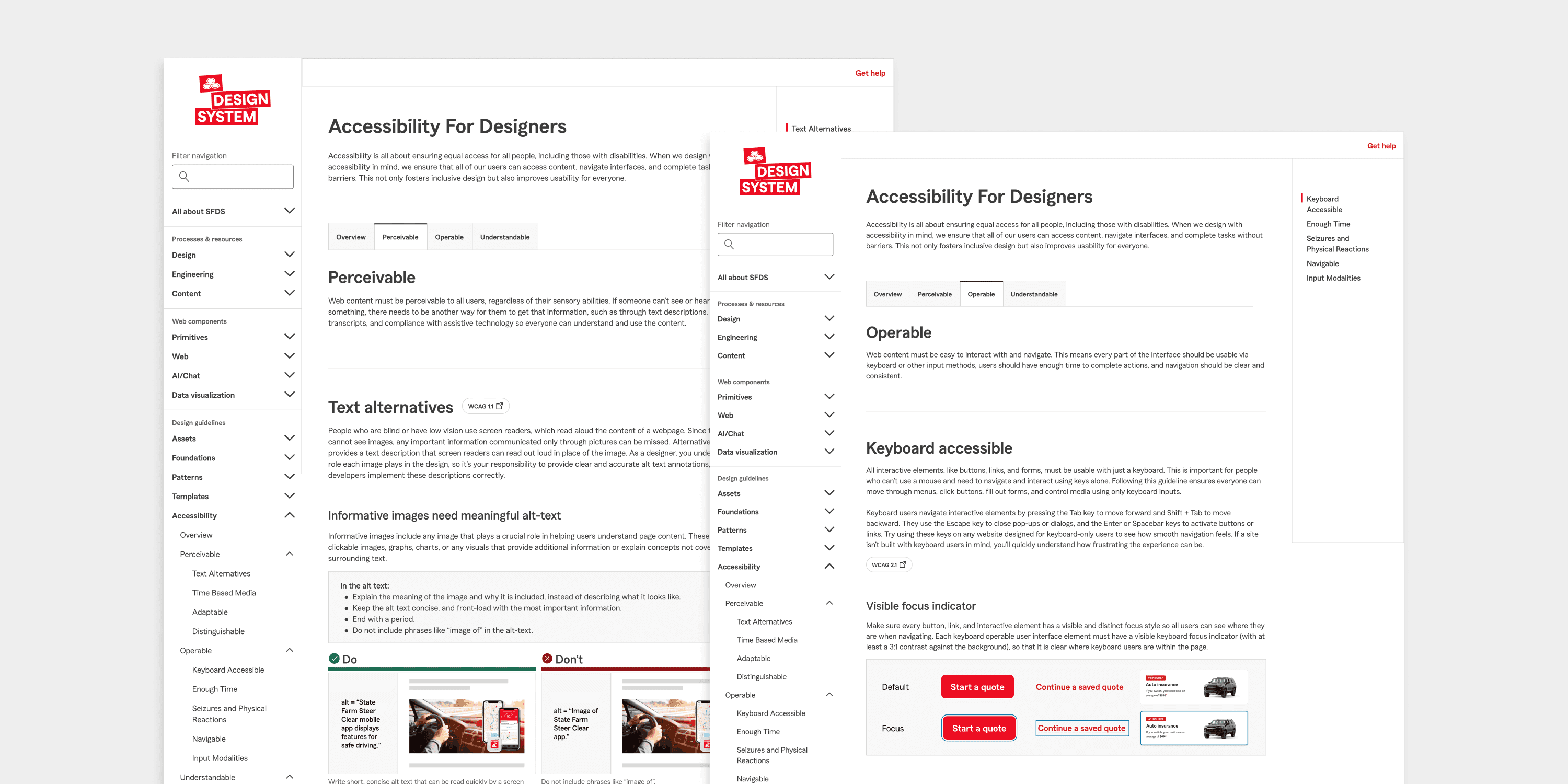
The first step was to solve the knowledge gap. Designers need to understand all aspects of accessibility before they can integrate it into their process. So, I created guidelines that explain accessibility for designers, to align them on what needs to be checked and achieve a shared understanding.
Features
Breaks down WCAG into plain language and follows the same structure incase designers want to cross-reference.
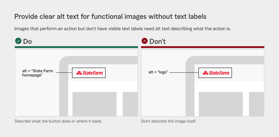
Uses “do/don’t” image examples that use the State Farm design system.
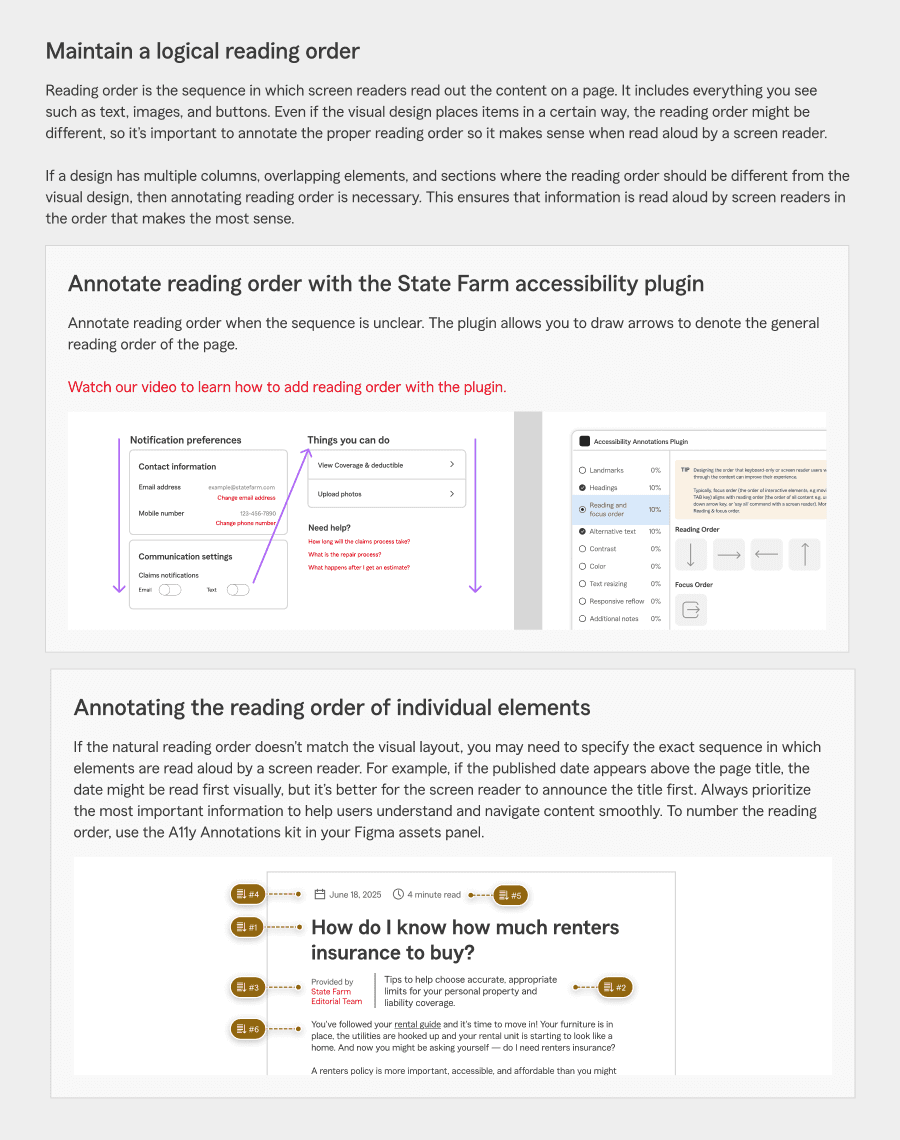
Explains how to annotate designs for accessibility.
Matches the visual style and format of existing design system component guidelines to maintain consistency.
Lives in a place designers reference often.
Creating the Guidelines
To build the guidelines, I studied accessibility resources from IBM, Google, and Apple for inspiration on visuals and examples. I also sourced real examples from State Farm products and internal sites. I referenced Stark’s WCAG Simplified and Stephanie Walter, and used AI to rewrite WCAG rules into accurate, concise, easy-to-understand summaries.
Reviewed by the Accessibility Team
These guidelines were reviewed by the accessibility team, who provided specific feedback to both the text and images to ensure accuracy, which I revised in the final guide.
Testing the Guidelines with 7 Designers
I tested the guidelines with seven designers to assess clarity and usability. Partnering with the Research Team, I refined my testing plan and script. I also created a demo exercise using a State Farm page with built-in accessibility errors, allowing us to see how effectively the guidelines supported designers in practice.
After testing, I collaborated with the design and accessibility teams to revise the guidelines by simplifying text, enhancing visuals, and clarifying annotation instructions. I also analyzed tester behavior, what they skimmed, which visuals helped most, and where confusion remained, to refine the content for better clarity and usability.
Instructional Videos on Accessibility Annotations
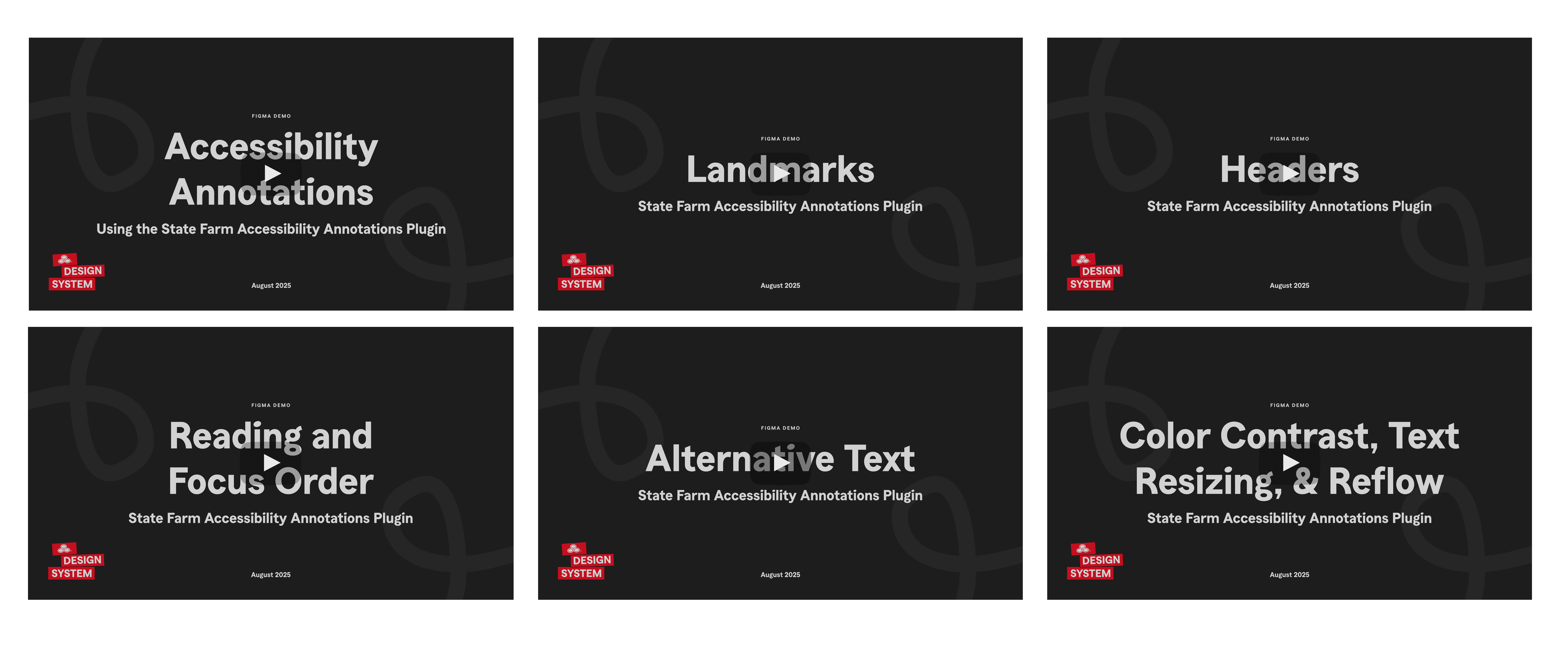
The design team was building a Figma plugin to make annotations a quick process. To support this, and since annotations remained a point of confusion from my testing, I created six short training videos explaining why annotations matter, when they’re needed, and how to use the plugin. I drafted scripts, presentations, and demos and reviewed them with the accessibility and design systems teams before recording.
Accessibility Checklist
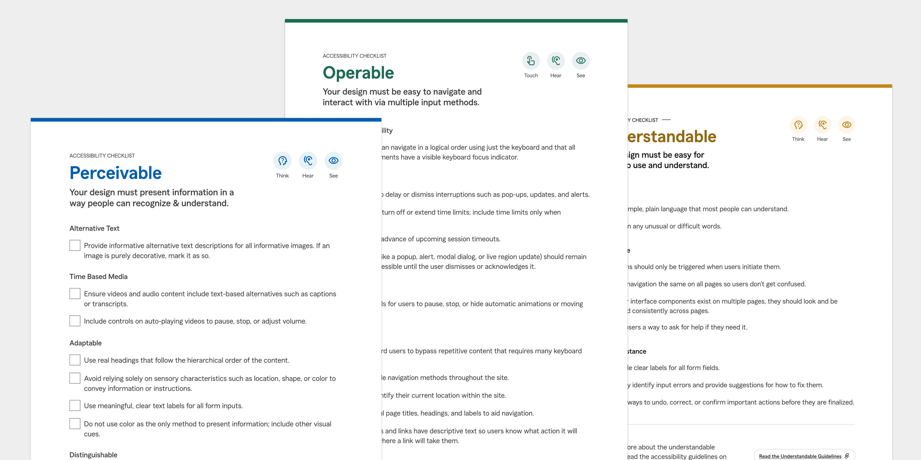
Since some testers found the guidelines to have too much text, I summarized accessibility principles into a one-page checklist. Each point was phrased as a single actionable sentence, making accessibility easier to embed.

Proposing a Clear Process to Leadership
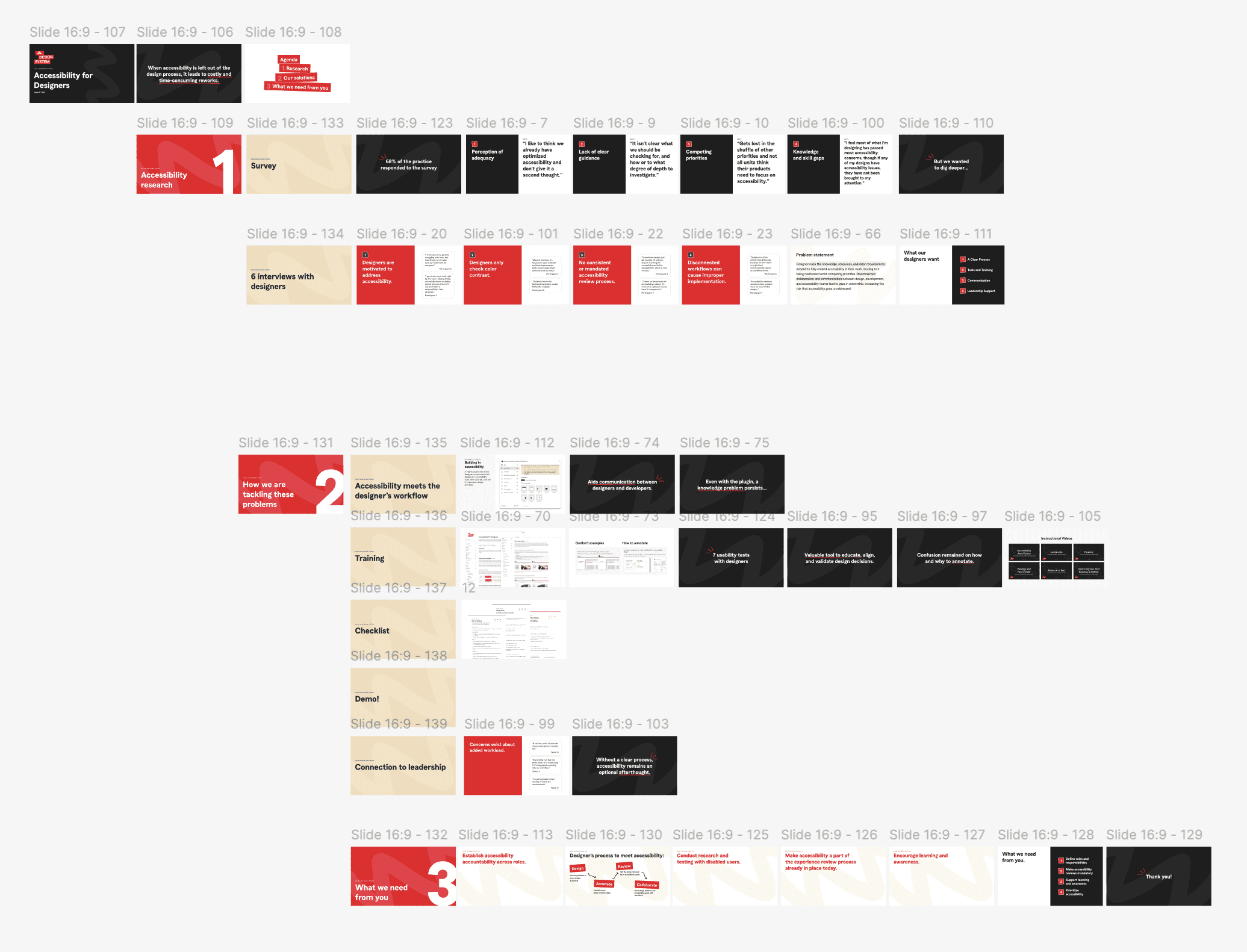
I wrapped up my internship by presenting findings and solutions to design leadership, structuring the presentation to tell a clear story:
Problem: Accessibility isn’t consistently embedded in design
Evidence: Survey and interview insights, key pain points
Solutions: Guidelines, checklist, annotation plugin, and instructional videos
Asks: Leadership support, accountability, mandatory accessibility reviews, testing with disabled users, and ongoing communication to raise awareness
This approach clearly conveyed the problem’s urgency and provided actionable steps leadership can take to integrate accessibility into the design process. The presentation was well received with leadership expressing strong interest in addressing accessibility and support for implementing the recommended solutions.
Leading the Accessibility Project
My manager entrusted me with leading the accessibility initiative, expecting me to propose next steps, define solutions, and map out the details of what was needed. While I could seek his guidance, I was responsible for shaping the direction and driving the project forward.
I had to:
Identify problems and opportunities through research and testing.
Propose solutions that were realistic, actionable, and scalable.
Tailor my approach based on feedback, adapting solutions to align with designers’ needs and priorities.
Coordinate with multiple teams (design systems, accessibility, research) to refine ideas.
Make decisions on what to prioritize, what to simplify, and how to present the work.
Leading this project taught me how to balance independence with collaboration. I learned how to advocate for solutions, gain buy-in from stakeholders, and translate research into actions the company could realistically adopt.
XD Beyond
Branding for XD Beyond
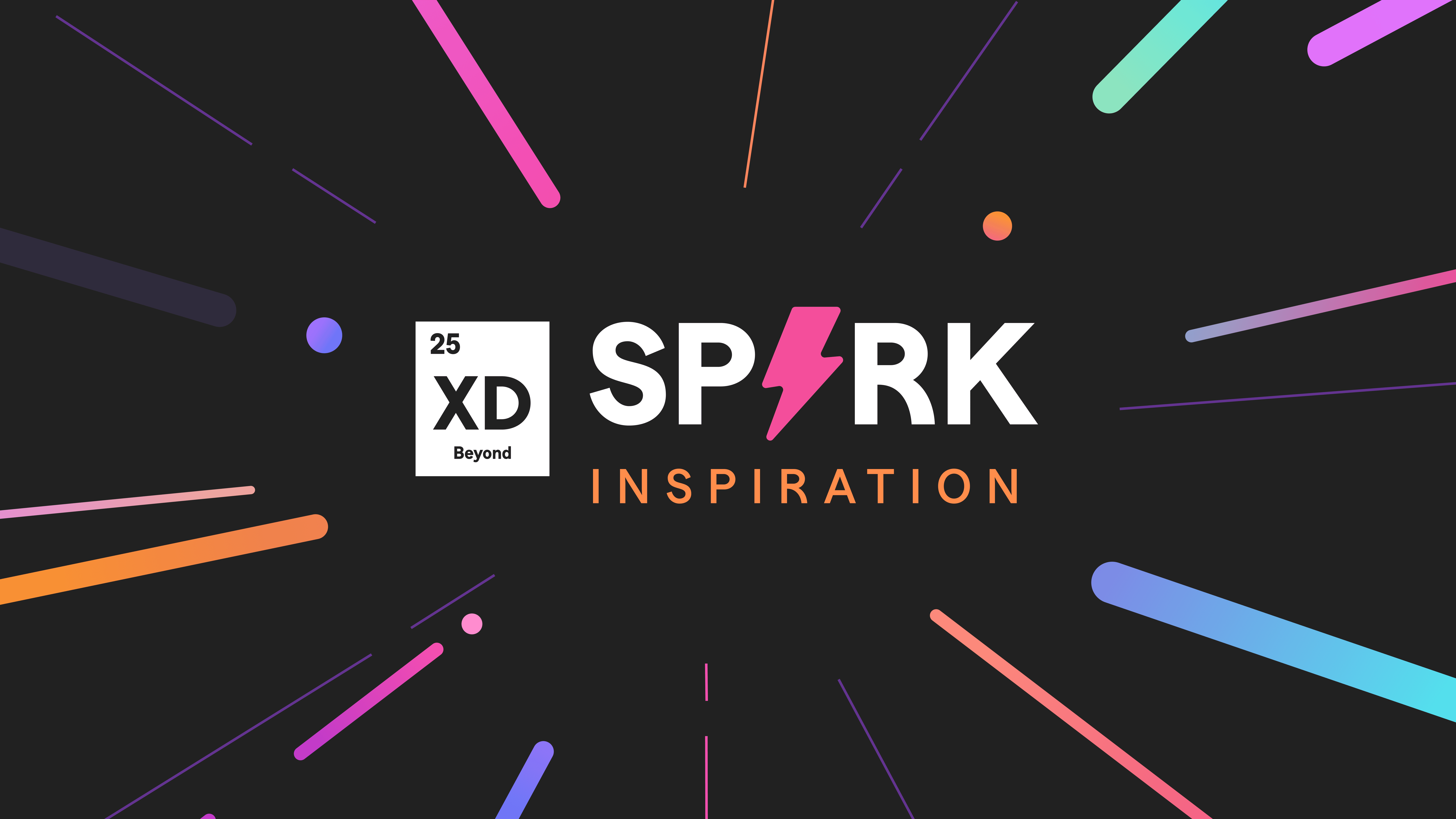
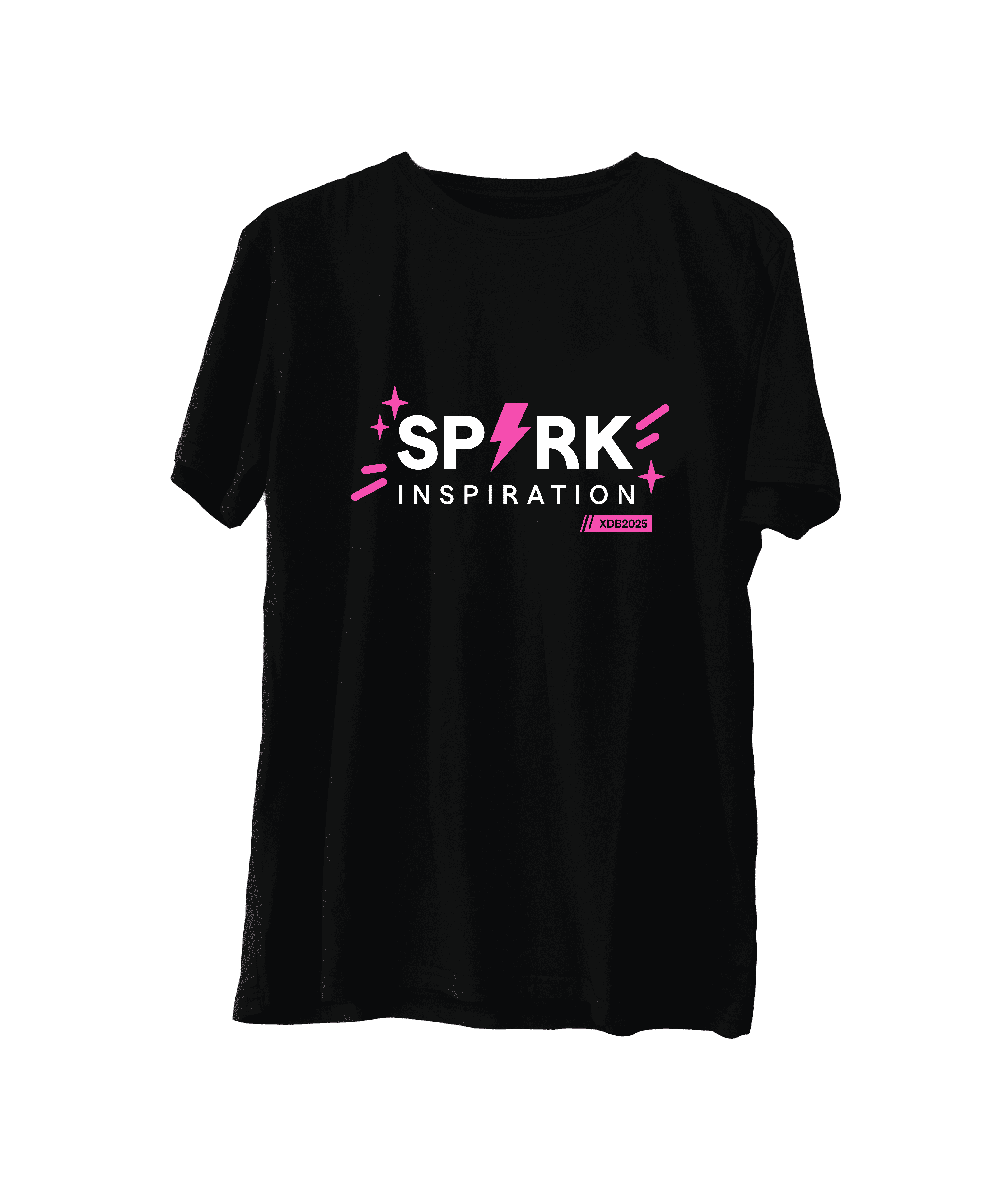
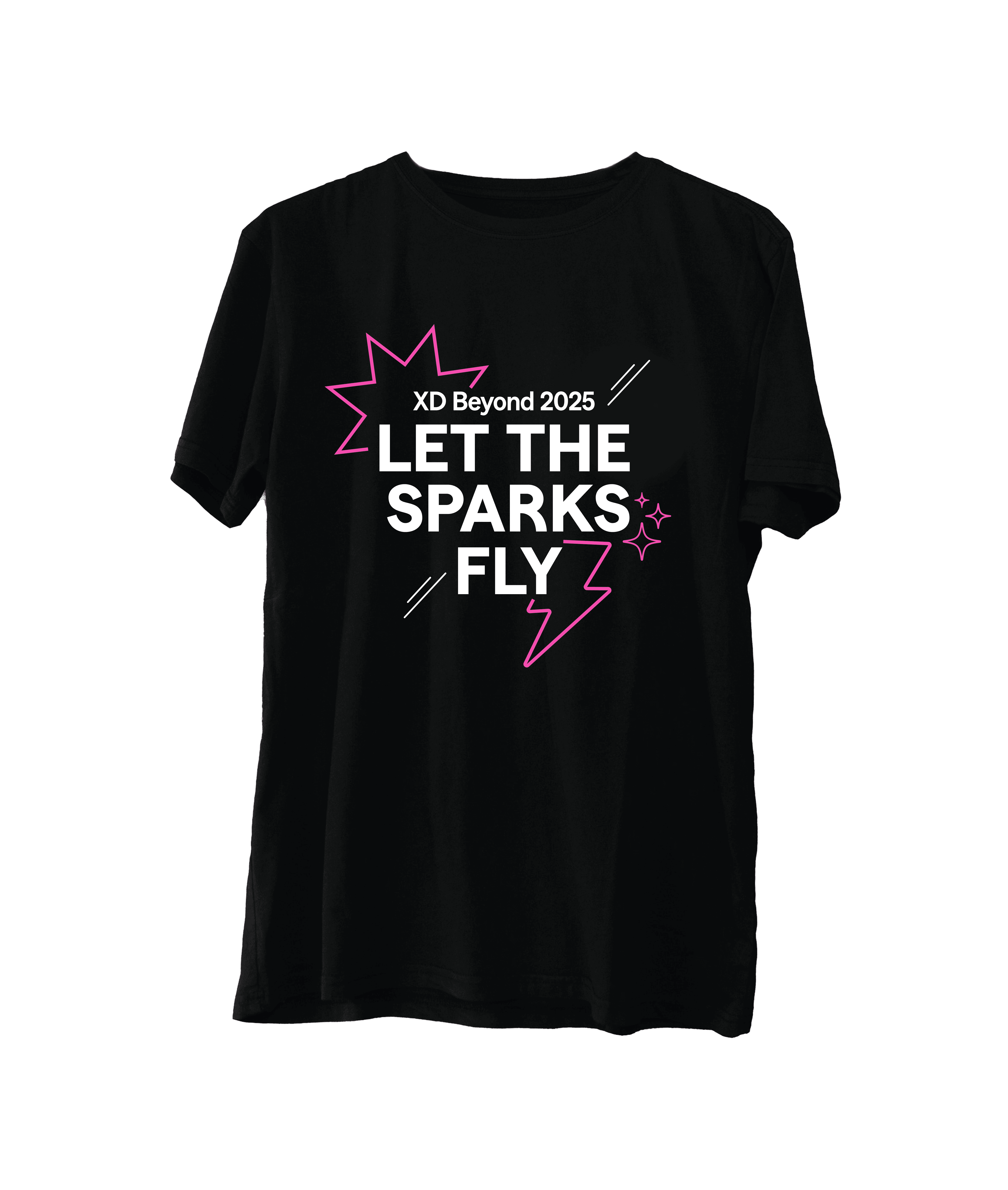
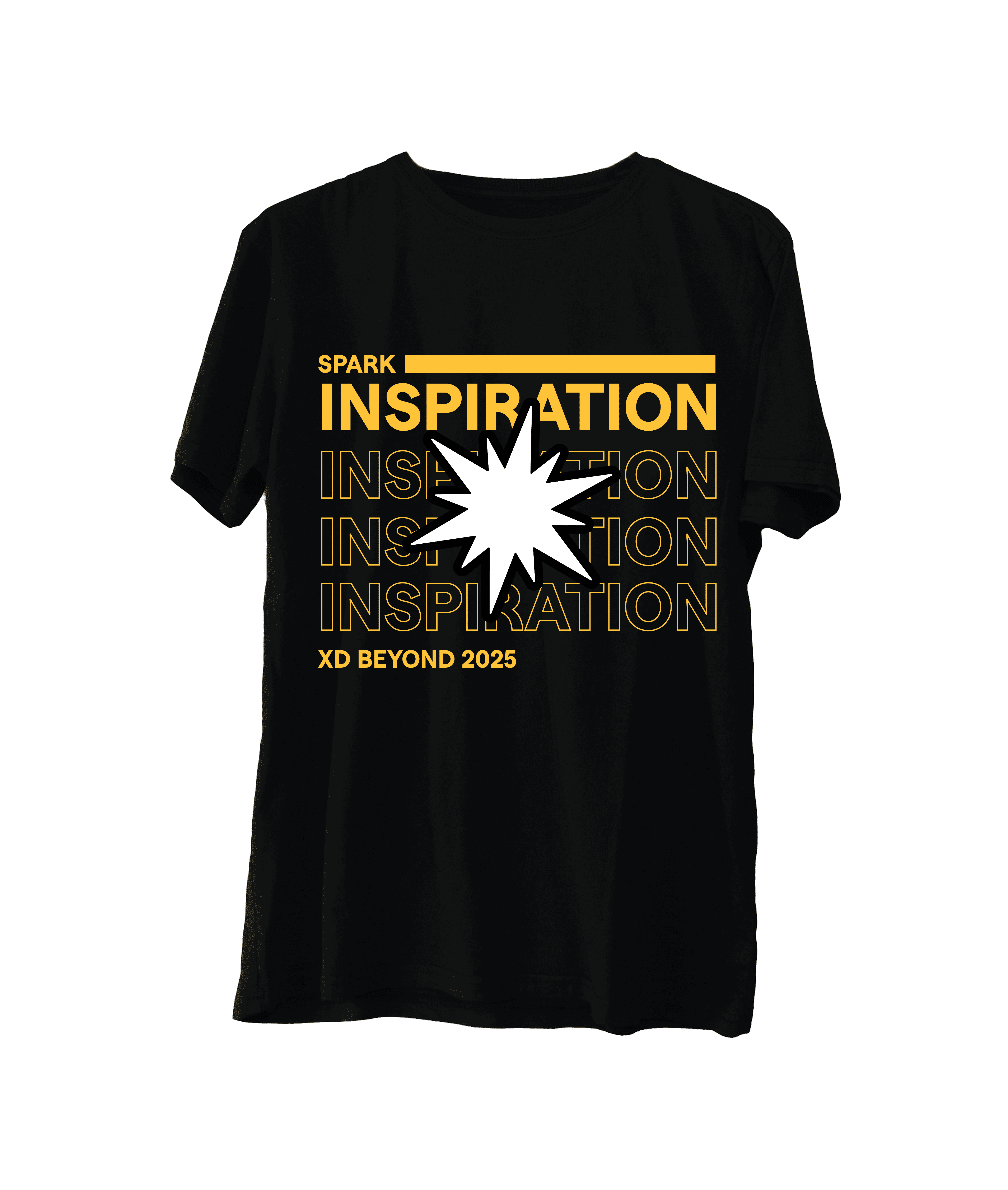
I joined the creative team to design the 2025 theme for XD Beyond, a State Farm design conference aimed at elevating UX, revealing trends, and educating designers. The 2025 theme, Spark Inspiration, reflects the sudden creative spark when ideas connect. My bold, playful visual style was selected by leadership to move forward, bringing energy and confidence to the conference experience.




Tech Astra
Branding for Tech Astra
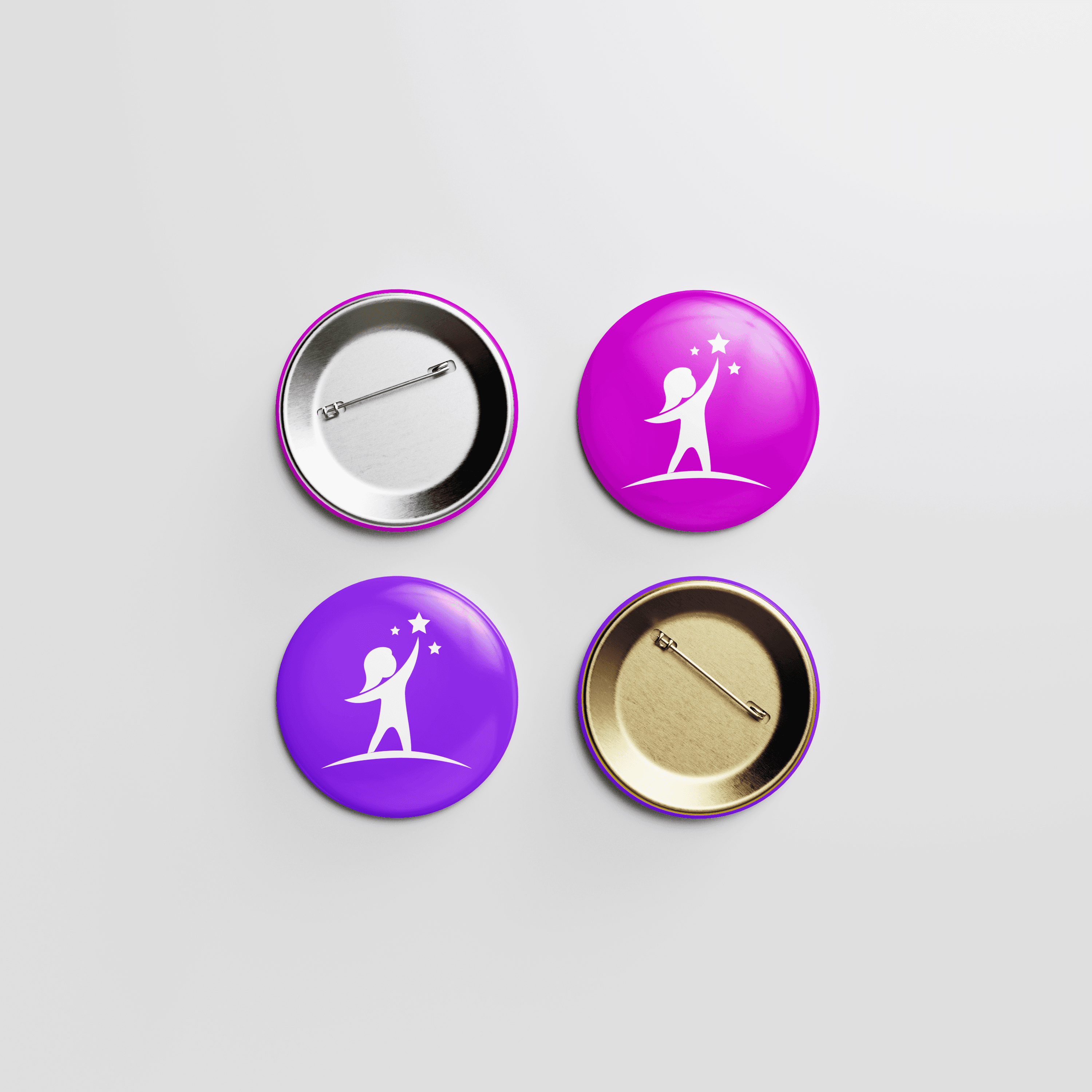
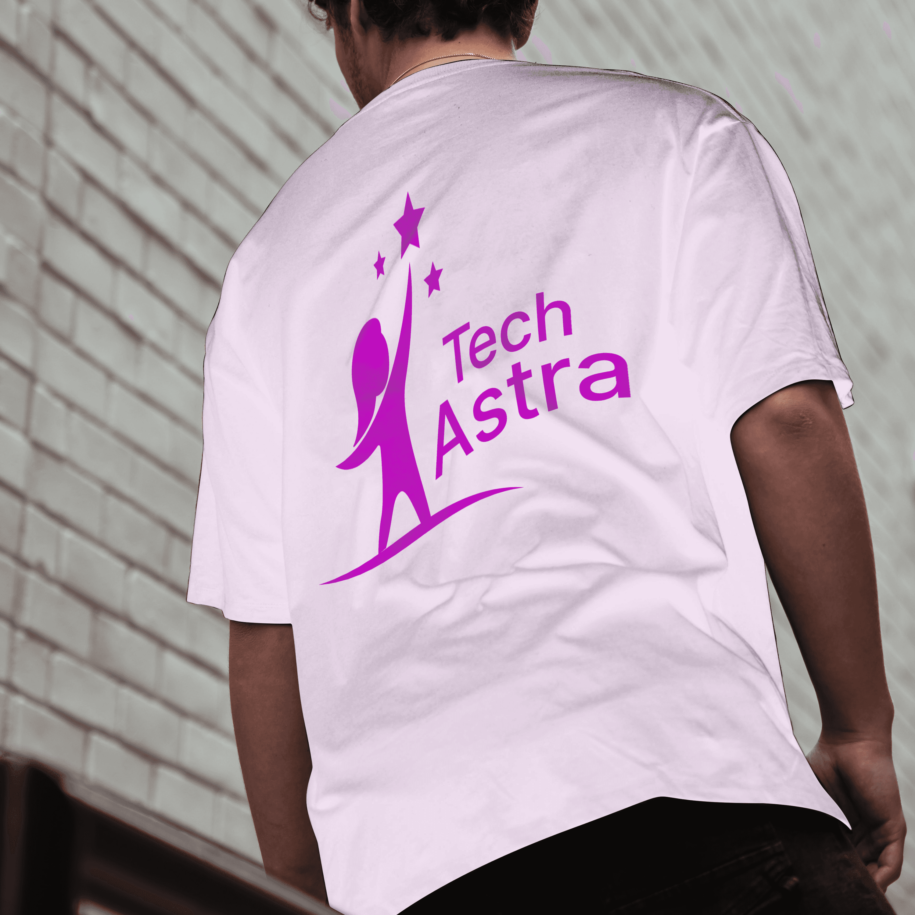
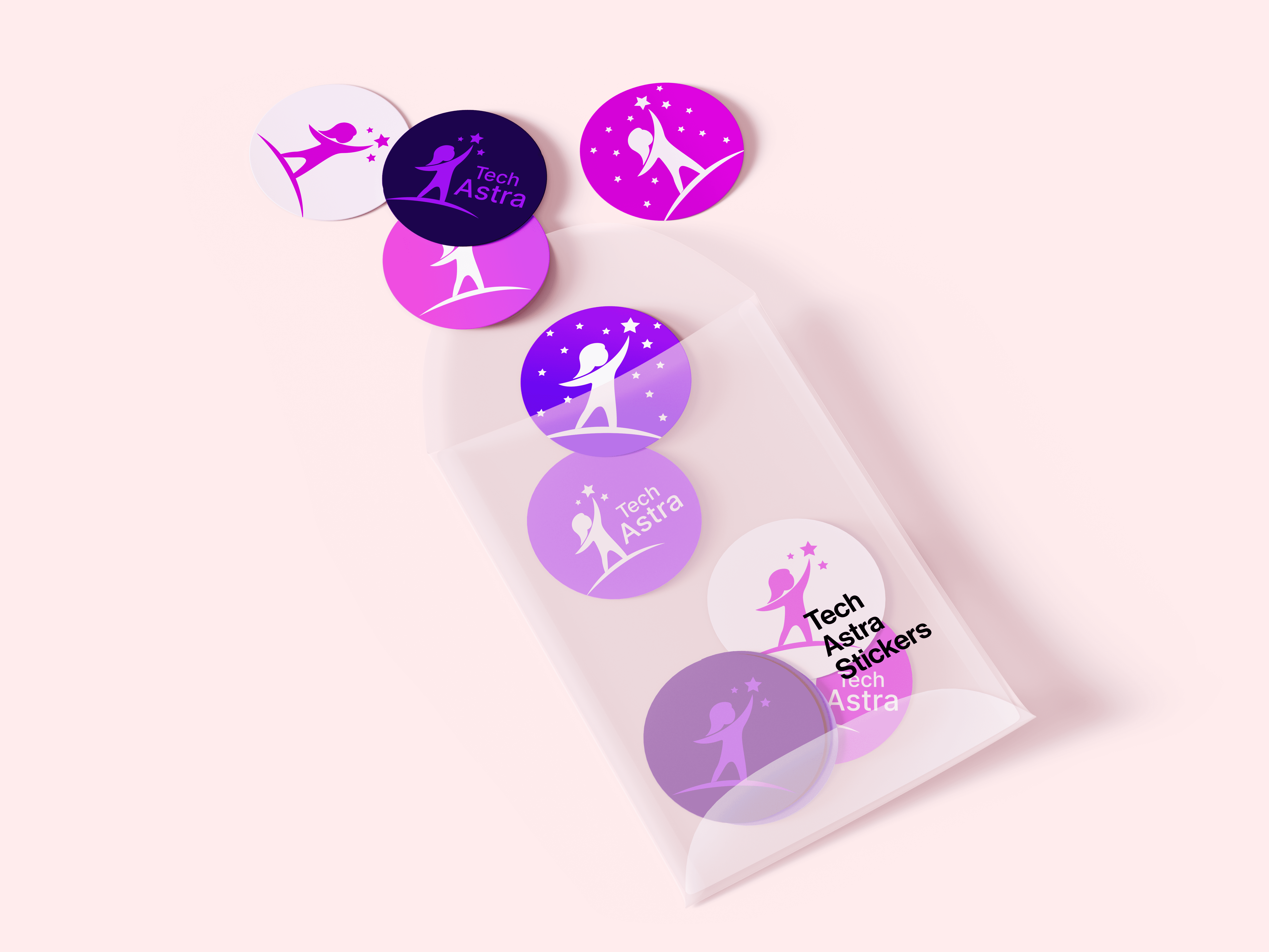
Tech Astra is a design conference that inspires young girls to pursue STEM. I co-designed the 2025 branding with two interns, Hannah Swan and Agustín Montalvo, creating a logo of a girl reaching for the stars to symbolize ambition and possibility. Bright purple and pink tones make the conference feel inviting, energetic, and inspiring.

Hack Day
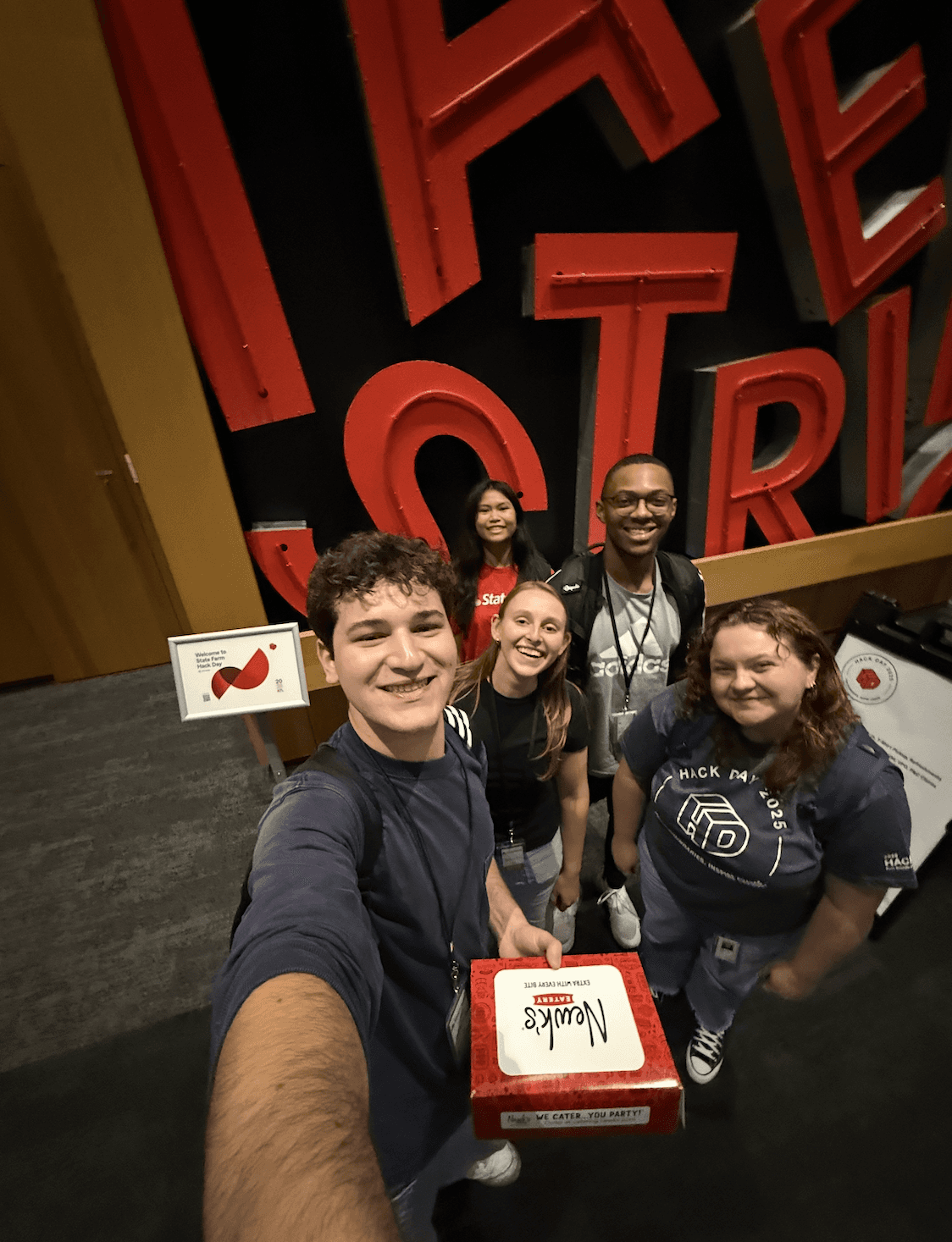
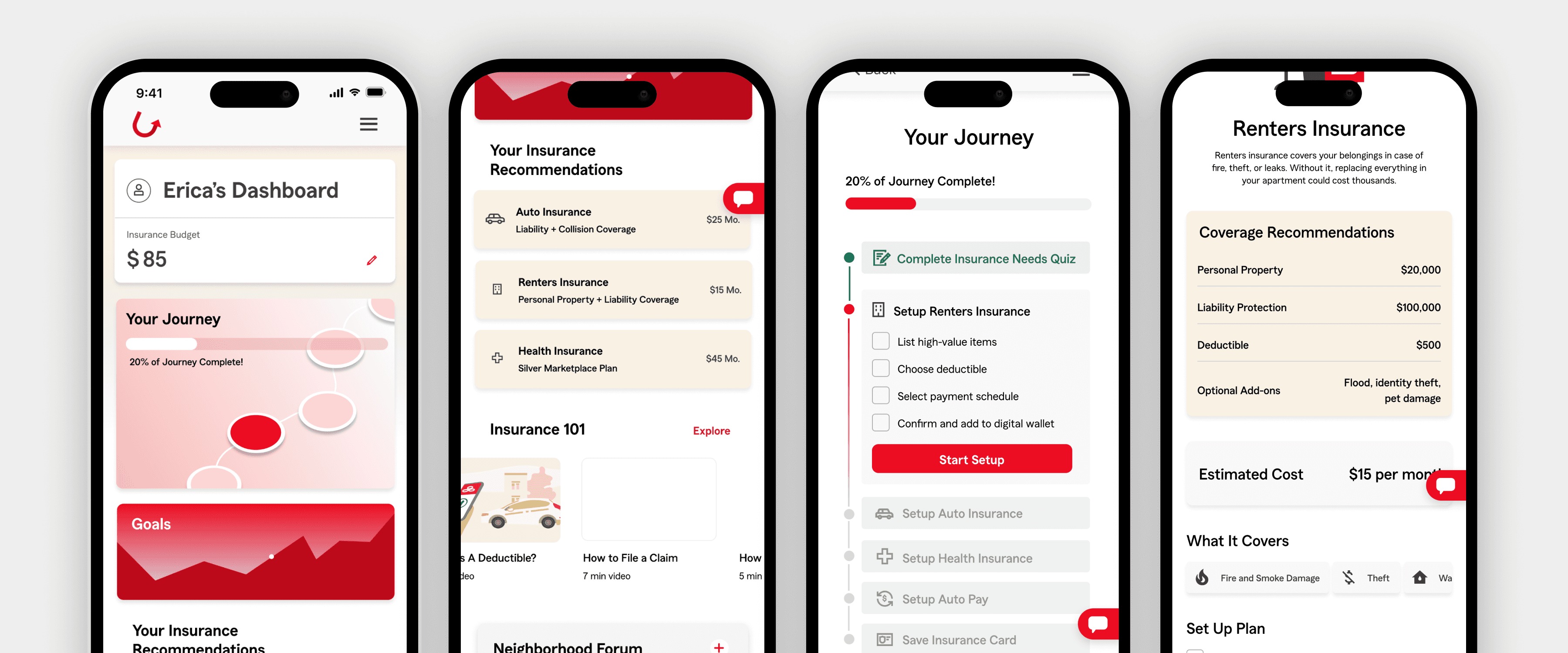
Hack Day Winners of the Low-Code Category with Our Concept in Development!
In my first week, I joined a 24-hour Hack Day with two product design interns and two software engineers. We created an app to help Gen Z understand insurance through personalized AI recommendations, short-form videos, and a community forum. I co-designed the UI in Figma, while engineers prototyped the forum interaction. Our concept won the low-code category and is now moving into real development.
Components
Component Design with the Design Systems Team
On the Design Systems Team, I contributed to daily reviews of components and icons for the new design system and AI features. I proposed AI prompt controls, AI icons, an AI-generated form field, and motion concepts for AI chat, researching patterns, iterating, testing in context, and building Figma components that other designers could easily use and customize.
Growth
What I Learned from My State Farm Internship
While I gained valuable skills in accessibility, research, component building, and branding, the most impactful learning from this internship was how to communicate and collaborate within a large corporate environment.
I learned how to adjust to a 9-5 schedule, balance meetings with tasks, and conduct one on ones with leaders. I became comfortable asking questions, sharing feedback with experienced designers, and advocating for my own ideas. Leading parts of the accessibility project taught me to make decisions, provide daily updates, and take ownership of outcomes.
This experience was both intimidating and exciting, I felt like a full-time employee making a real impact on the company. Some key takeaways I’ll carry forward:
Seek feedback early and often. Colleagues with more experience helped strengthen my work and gave me perspectives I wouldn’t have seen on my own.
Speak up. Even as an intern, sharing my thoughts in meetings added value and often influenced discussions.
Build relationships. Meeting new people across teams not only expanded my knowledge but also opened doors to future opportunities and unexpected support.
